
SOLO ENERGYA New Cultural Icon
- Packaging
- Brand Identity
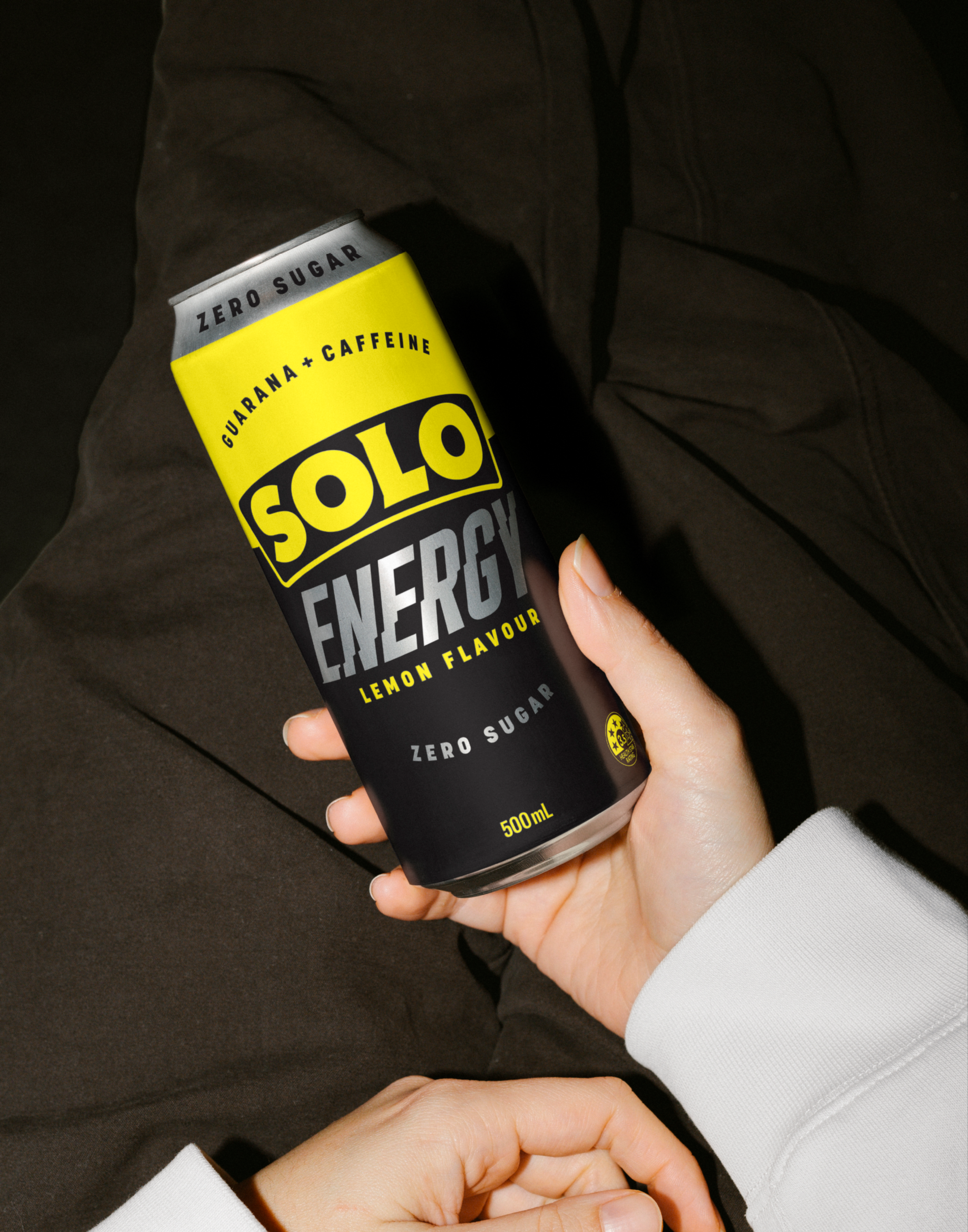
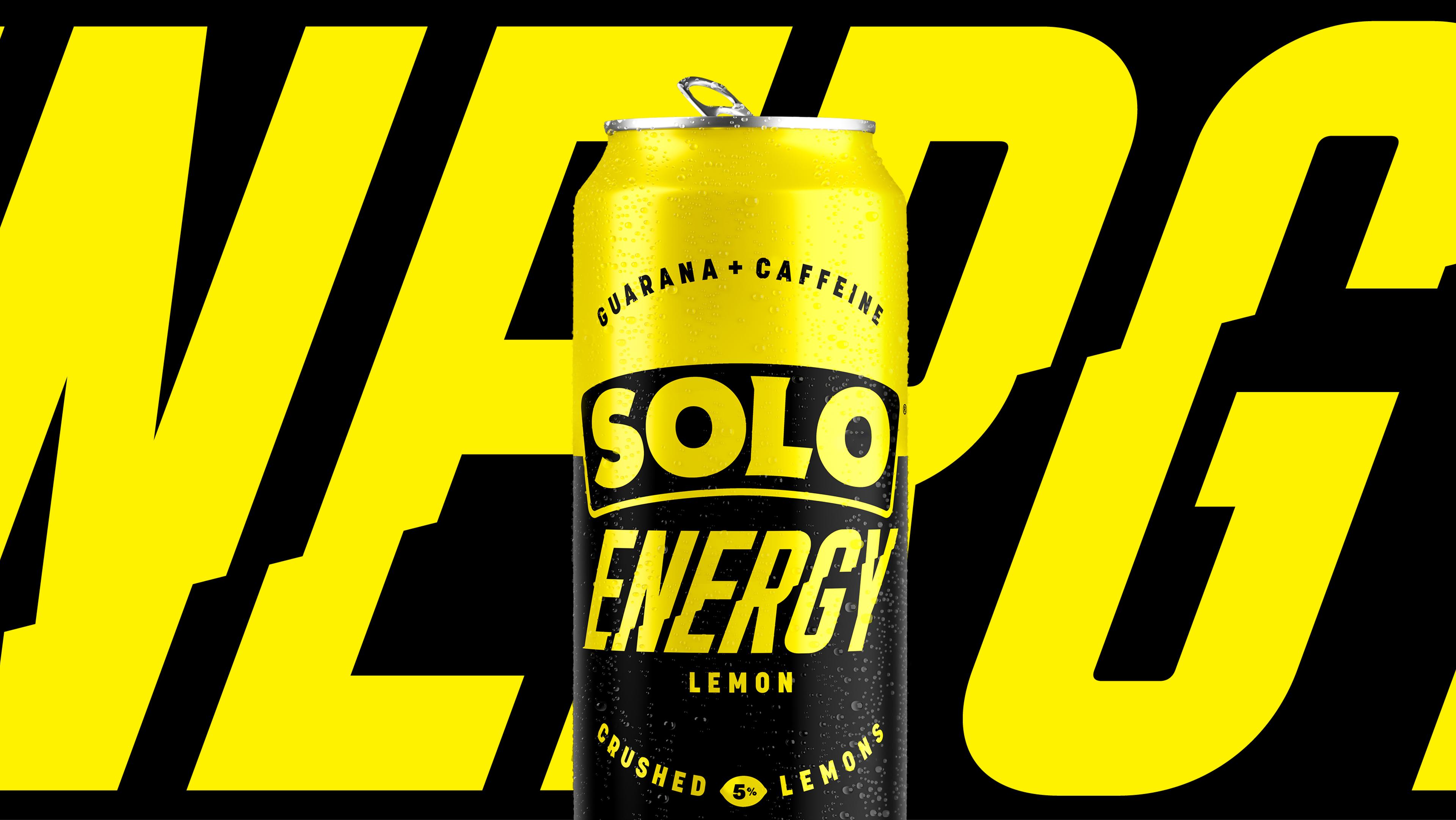
Solo has always owned ‘crushing thirst’. That hard-earned, post-effort, slam-it-down kind of refreshment. But the landscape is changing. And today’s drinkers seek more than just hydration after the fact, they want energy to take things on from the get go. Enter Solo Energy. Powered by caffeine, guarana, and that unmistakable Solo taste. A bold new identity built for momentum. Stripped of noise, made to scale. A new icon for a new kind of energy.


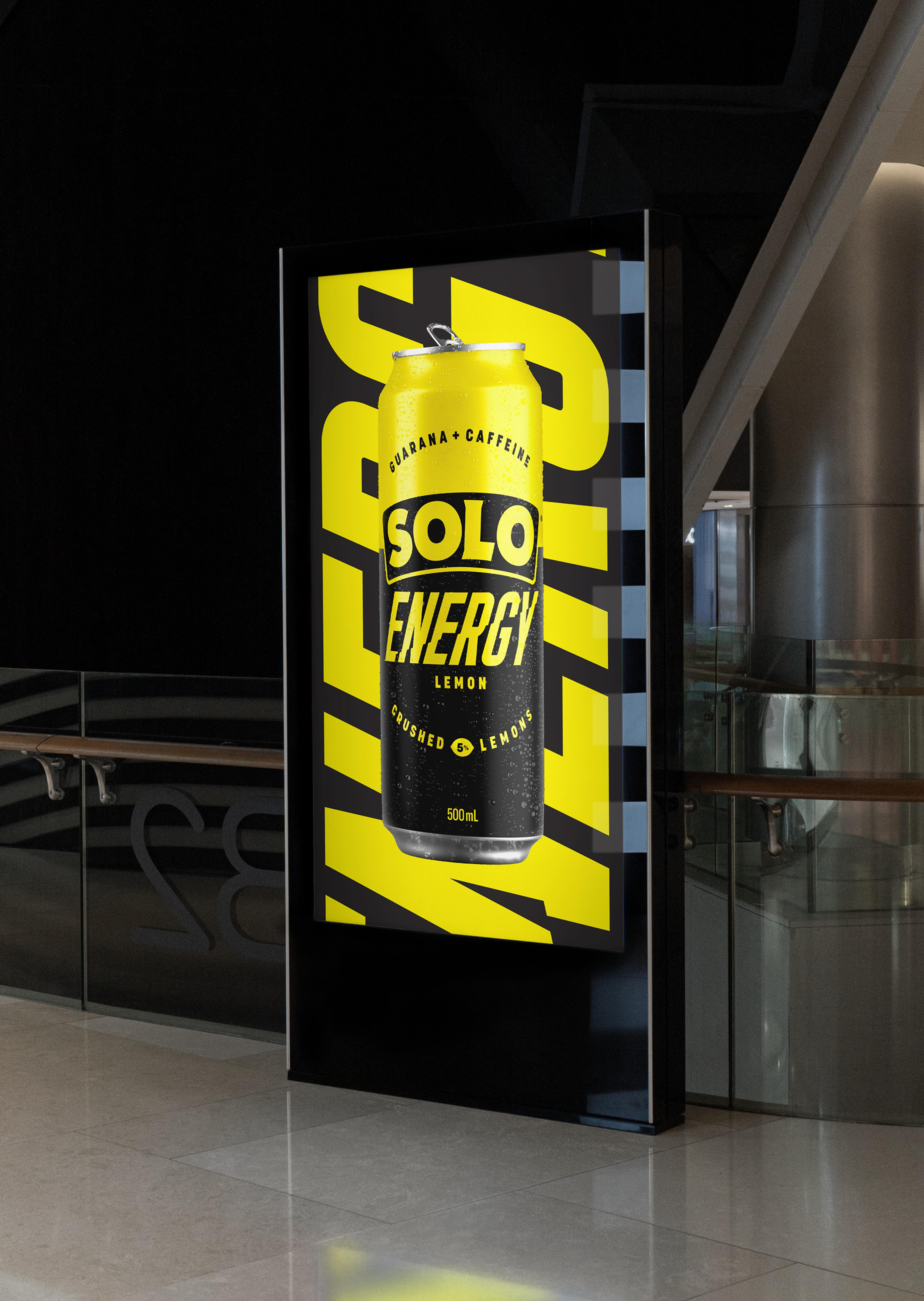


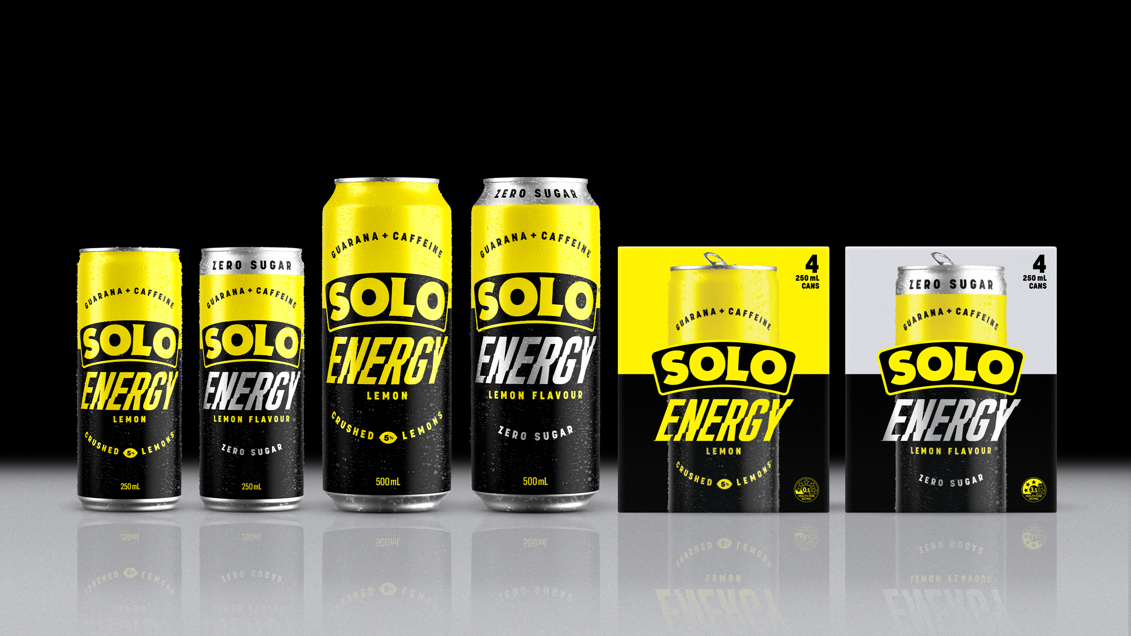

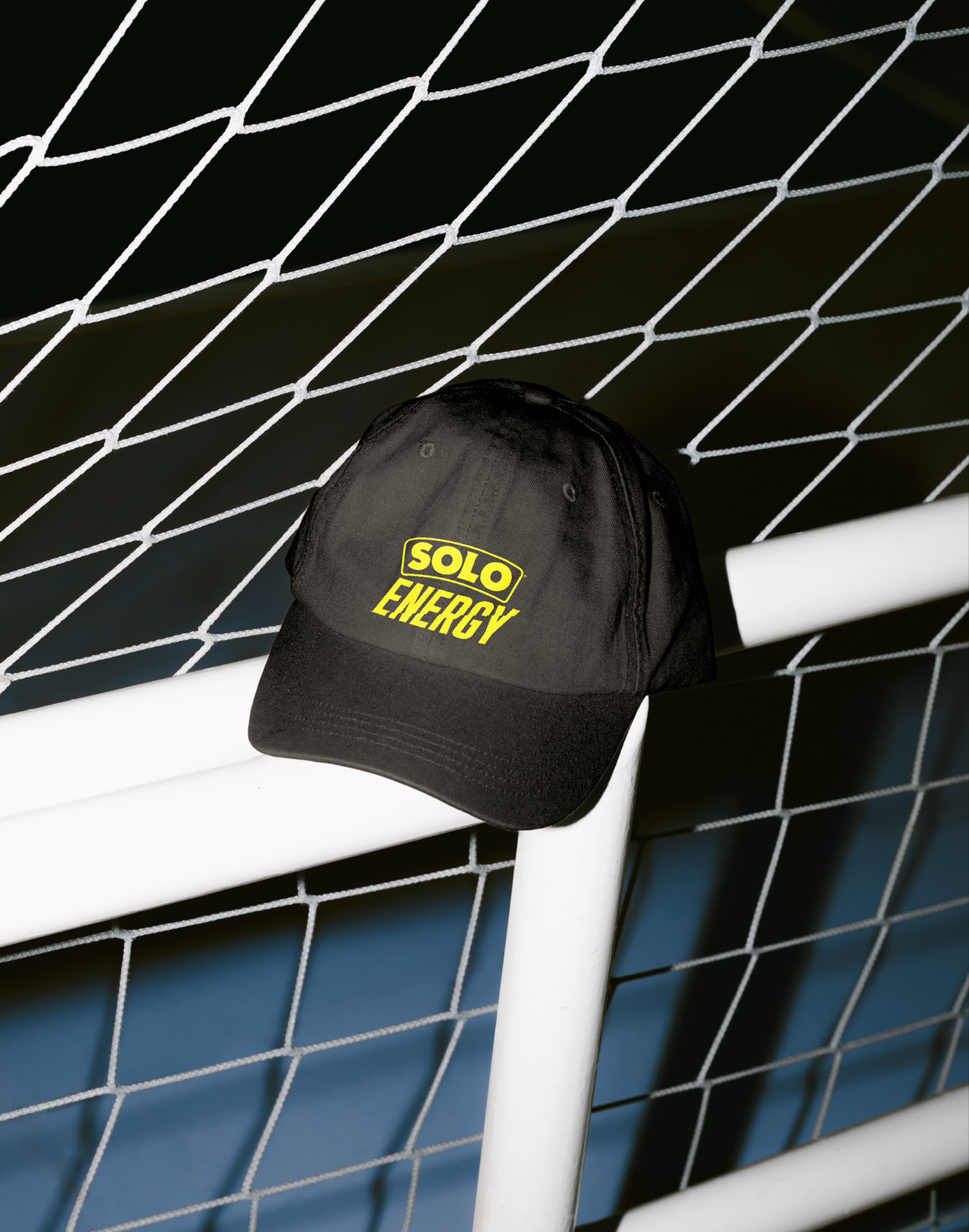
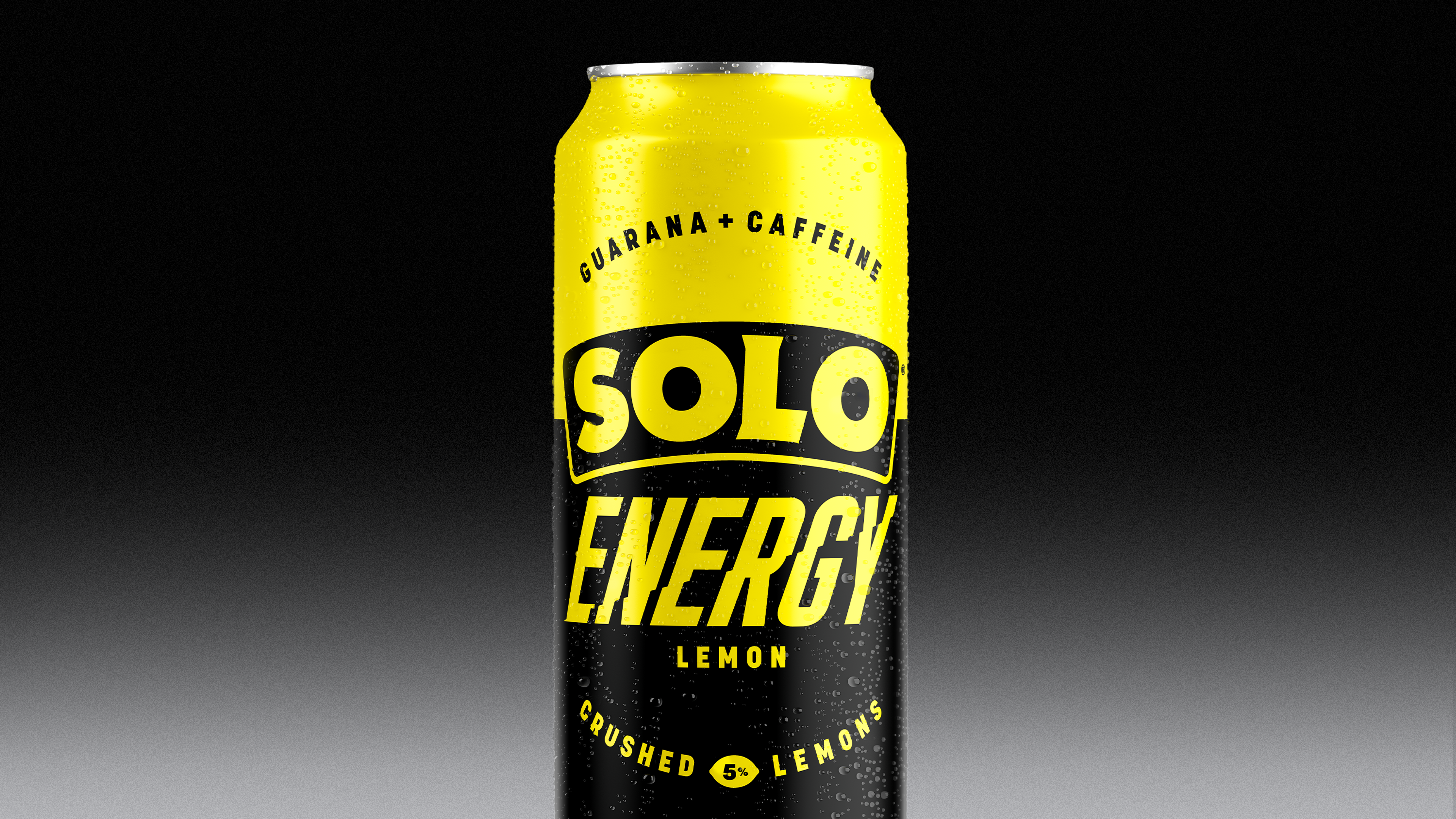
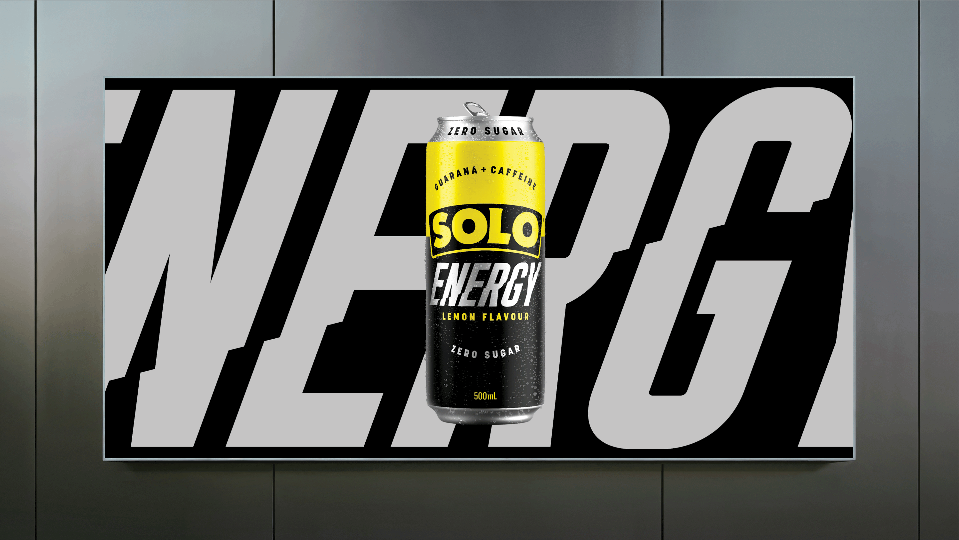
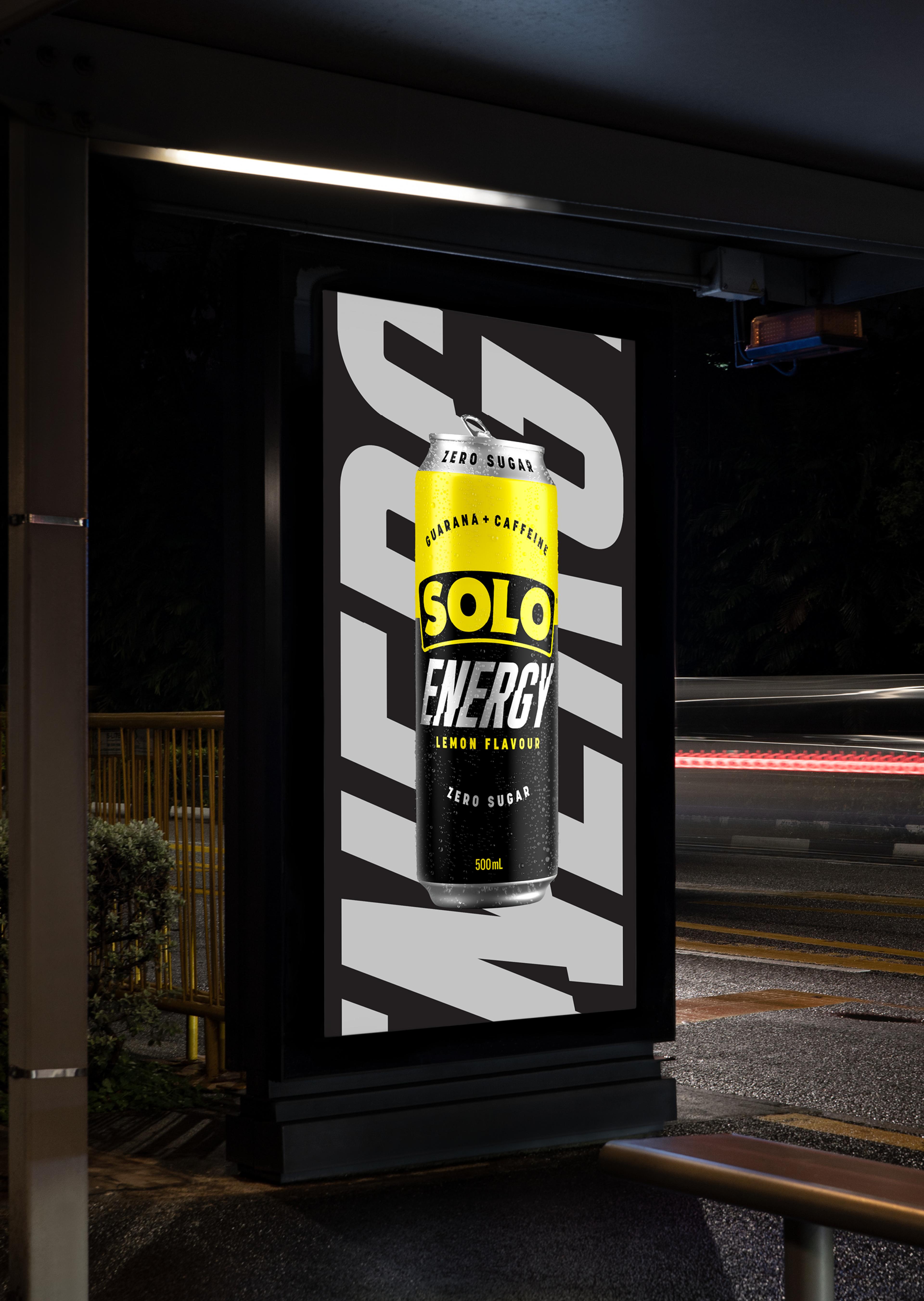
To bring Solo into the energy space, we reworked its most iconic assets. Stripped them back to its purest form, the wordmark was reimagined with an iconic silhouette and a neon-inspired outline. We paired it with a dynamic, high-impact font built for speed and clarity, reinforcing the feeling of constant momentum. The colour system is unmistakably Solo, but sharpened for now, black, silver, voltage yellow, and nothing extra. The result is a modernised identity that honours the original while signalling a new kind of energy.
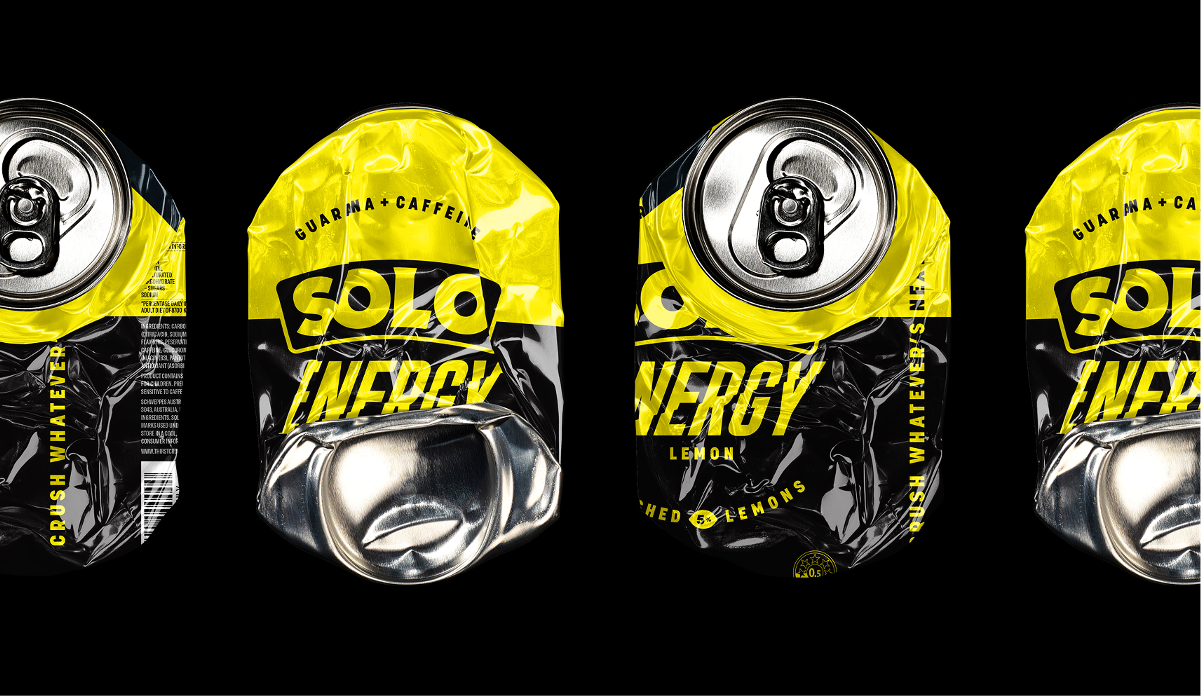

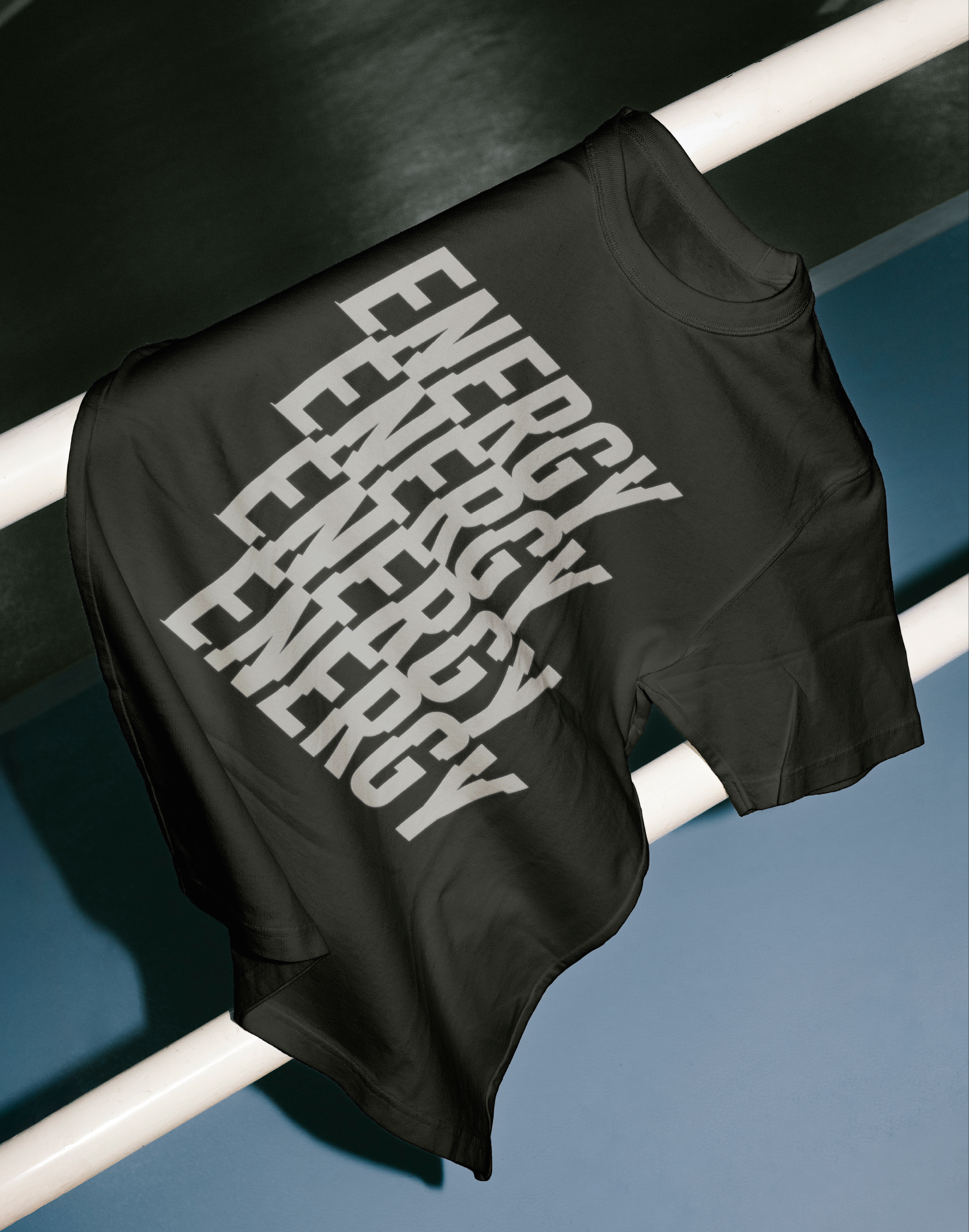
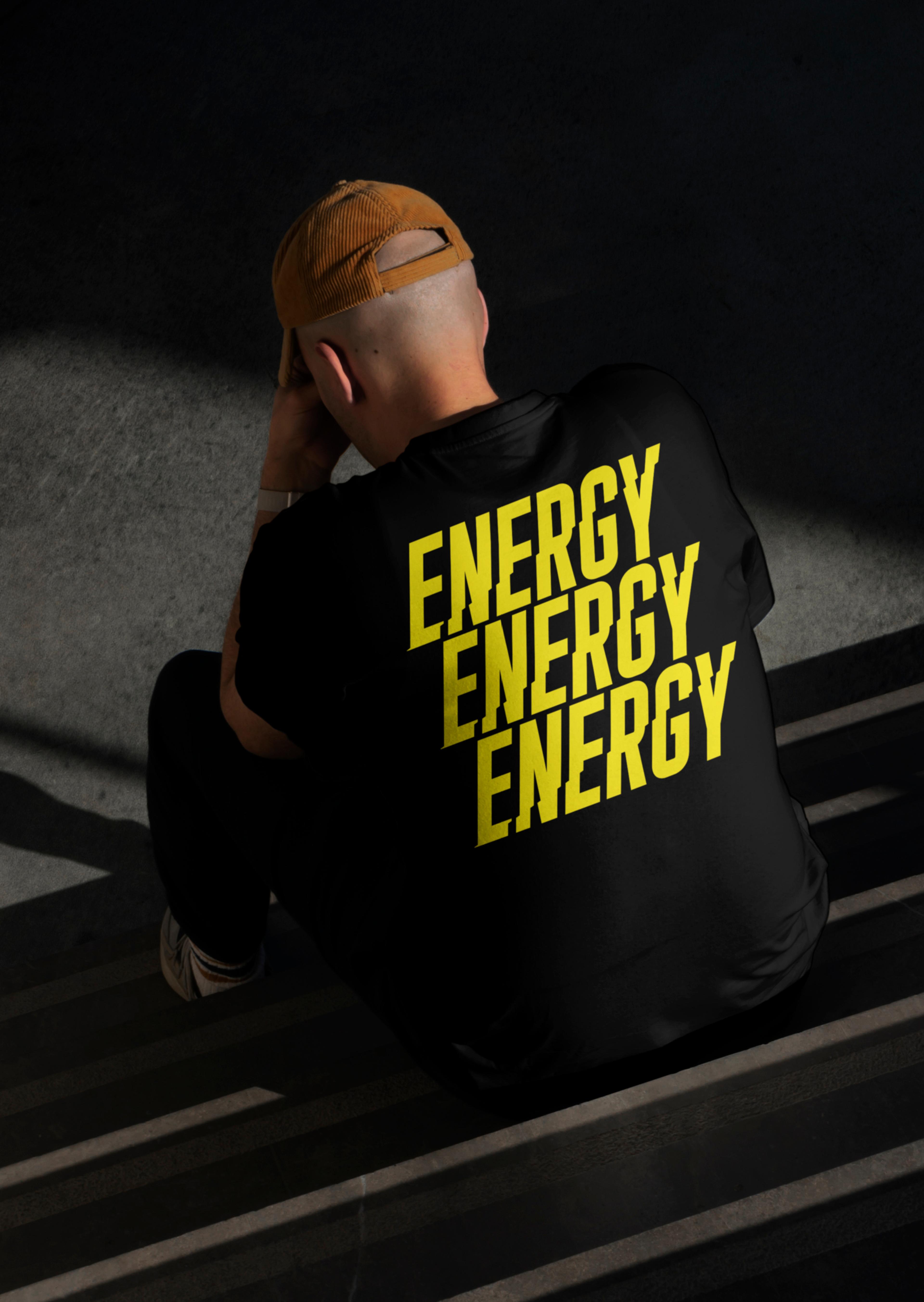
Solo had something most brands would kill for, decades of equity, a name people actually say out loud, and a clear product truth: it crushes thirst. The world of energy drinks was also evolving, providing an opportunity for Solo to take what it already owned and push it somewhere new. Somewhere free of the loud, maximalist tropes of the category. “Crush Whatever’s Next” let us evolve the idea of refreshment into forward motion. Speaking to real energy moments, work, sport, life, not just hype. It retains Solo’s essence, but adds relevance. Same brand, new charge. Ready for whatever’s next.

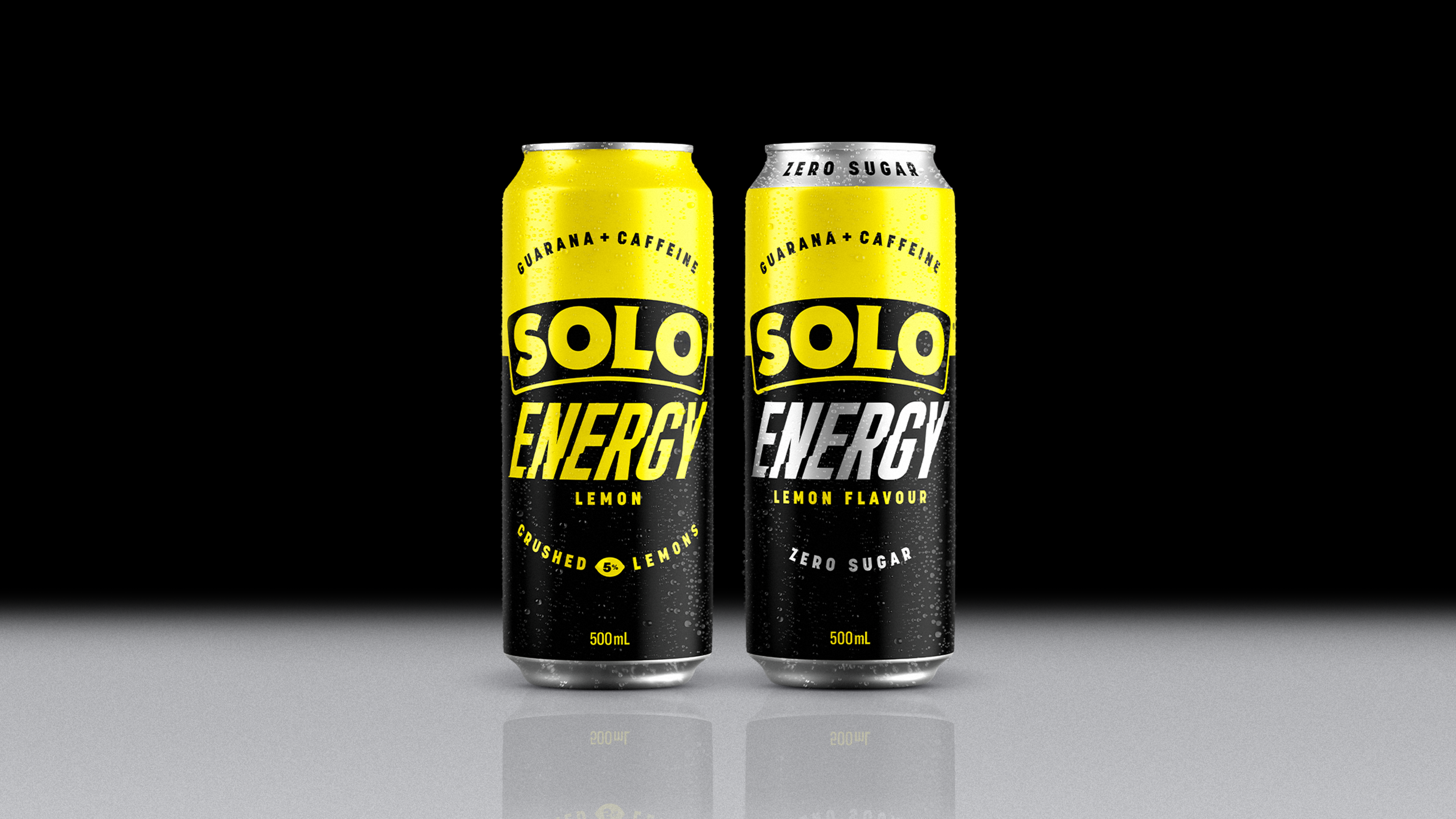

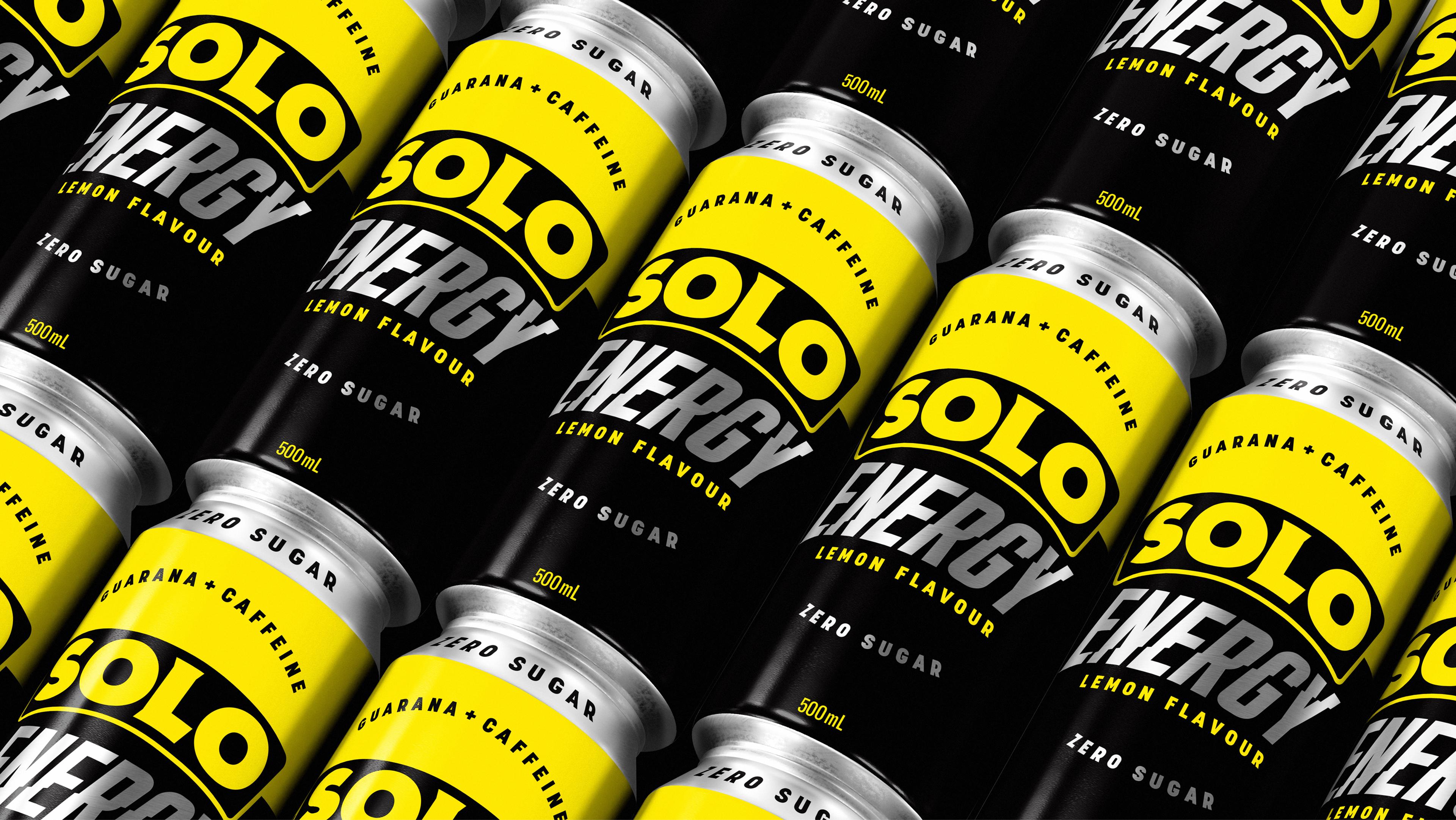


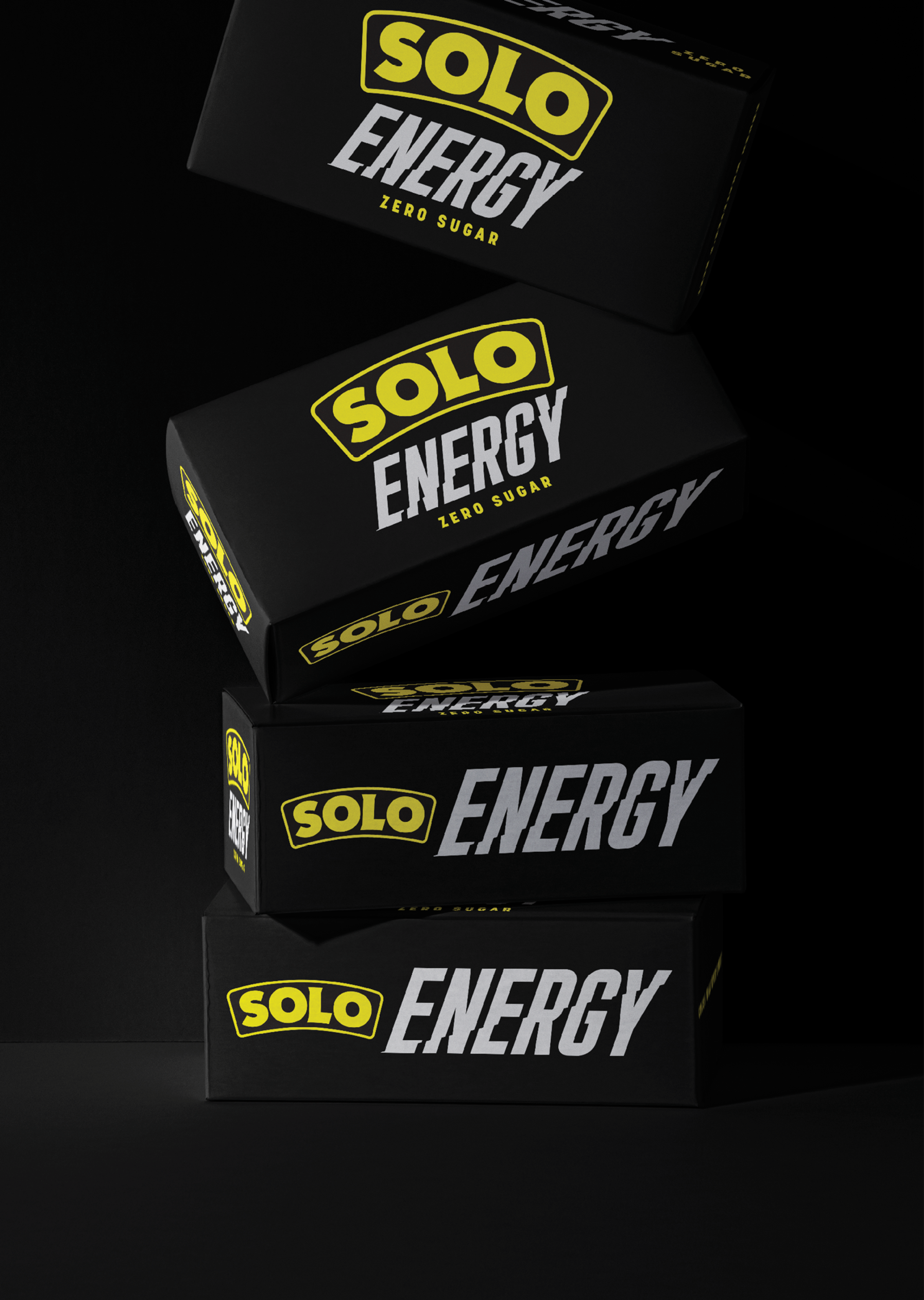

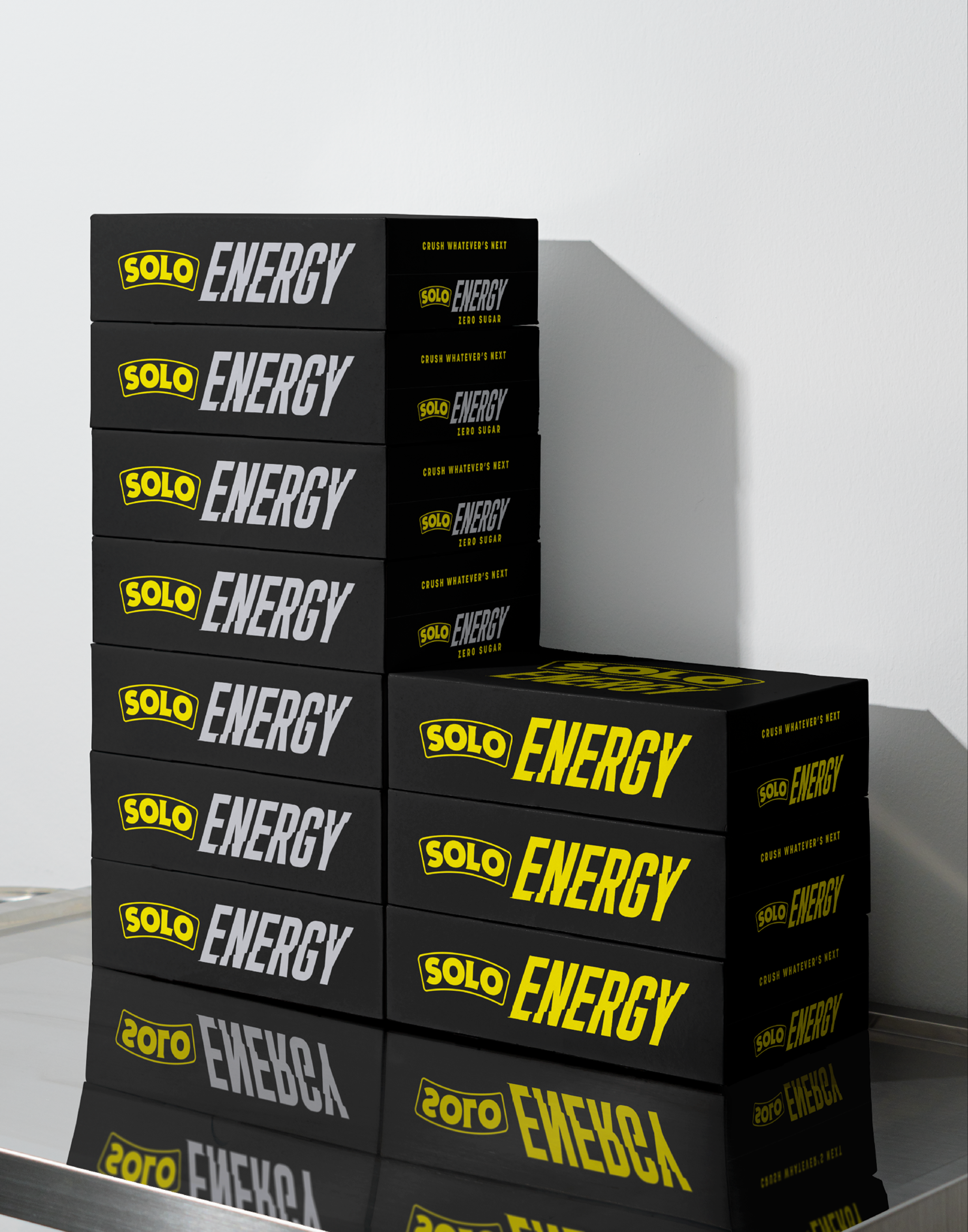
The identity was engineered as a system, not just a one-off. Every element, from the core mark to the colour logic, was designed to flex across a growing family of products. It allows for seamless expansion into new flavours, formats, and energy occasions without losing brand recognition. A clear, scalable foundation that gives Solo Energy a runway for future innovation.