SLATHERSkin in the Game
- Brand Identity
- Packaging
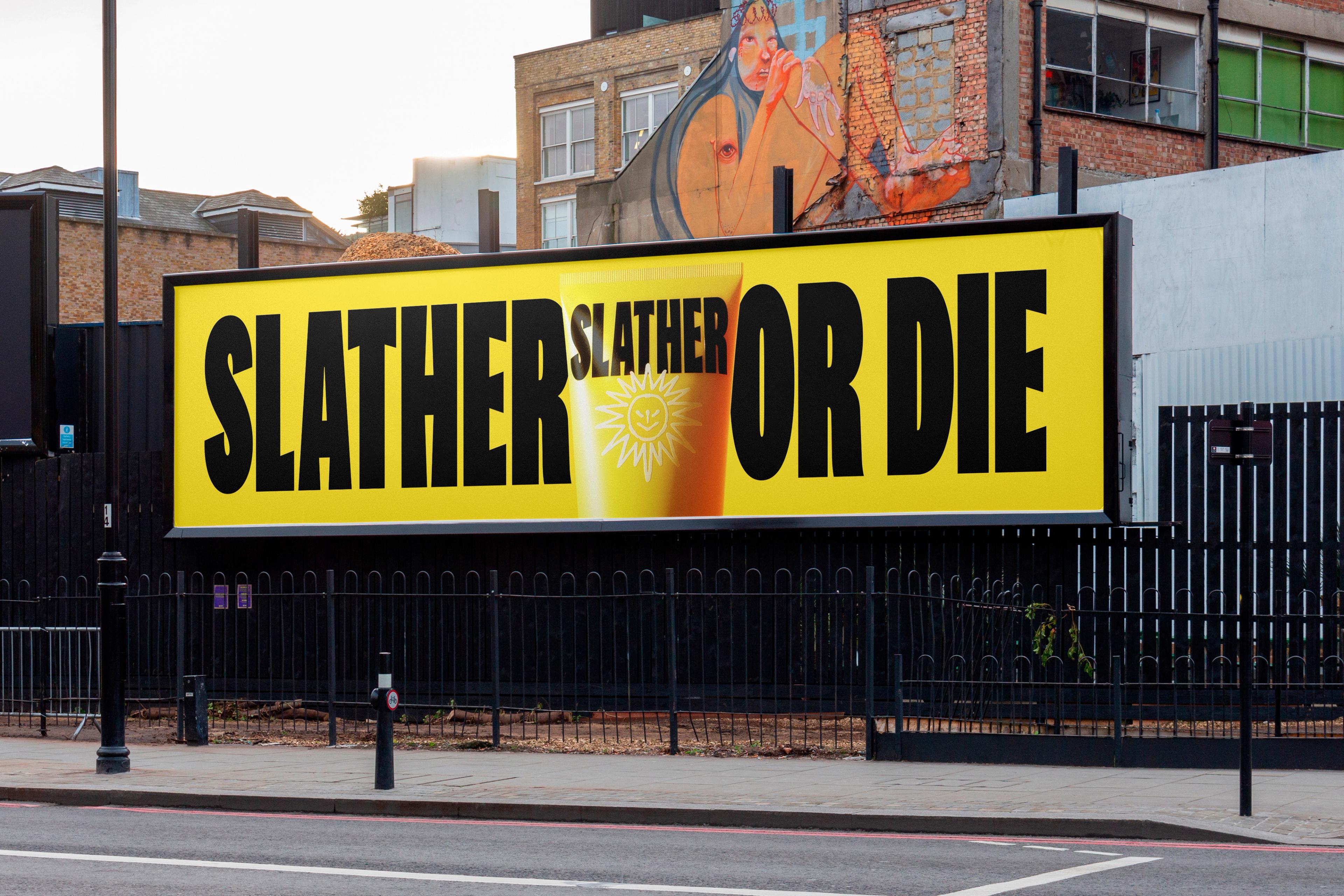
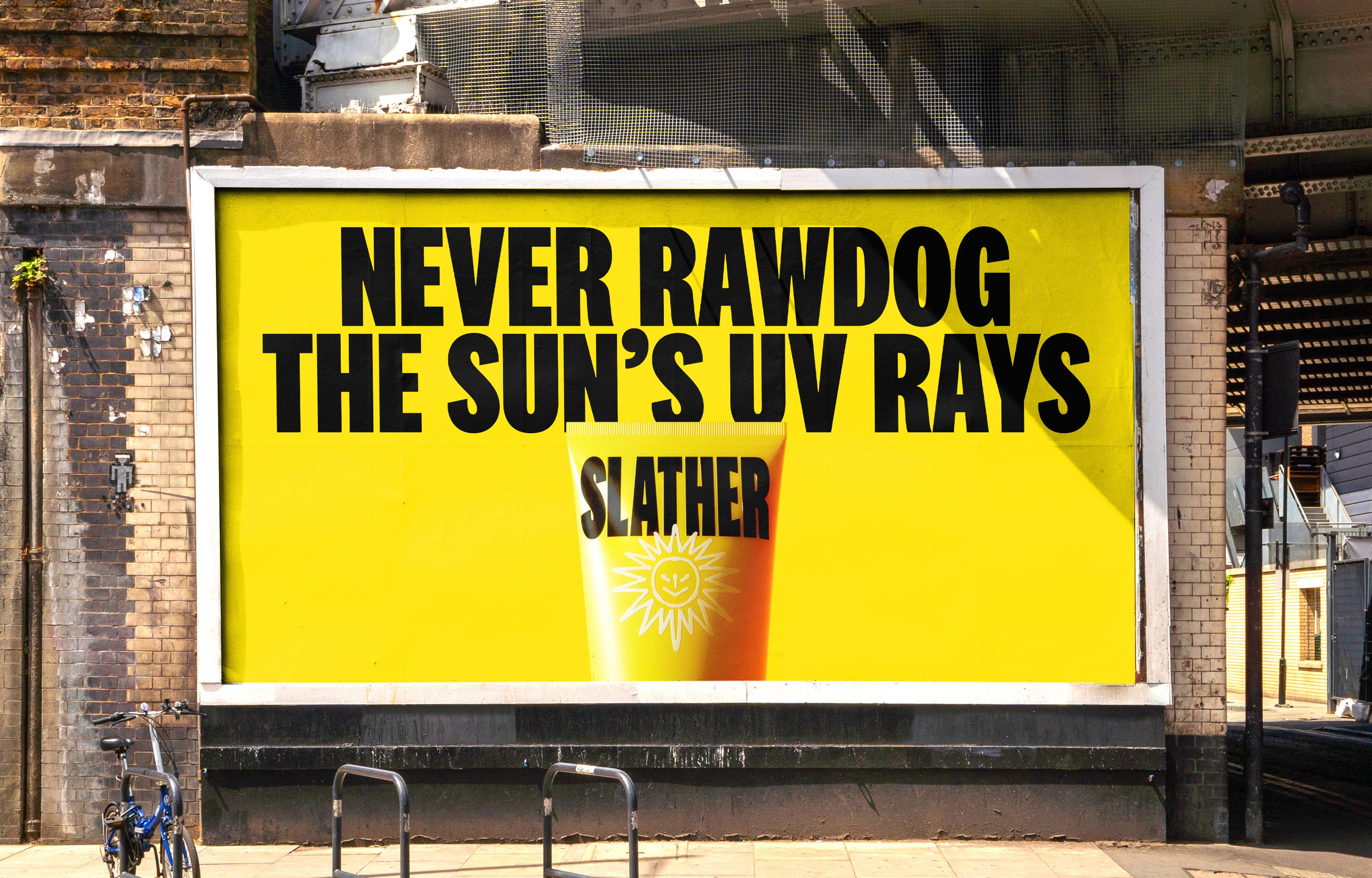
- Campaign
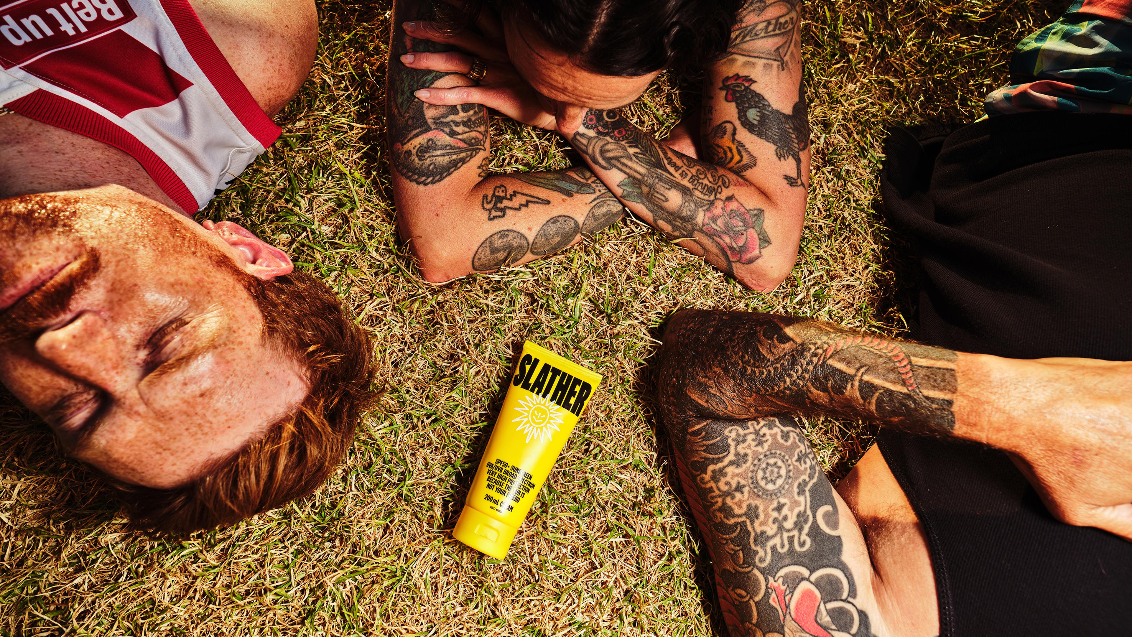
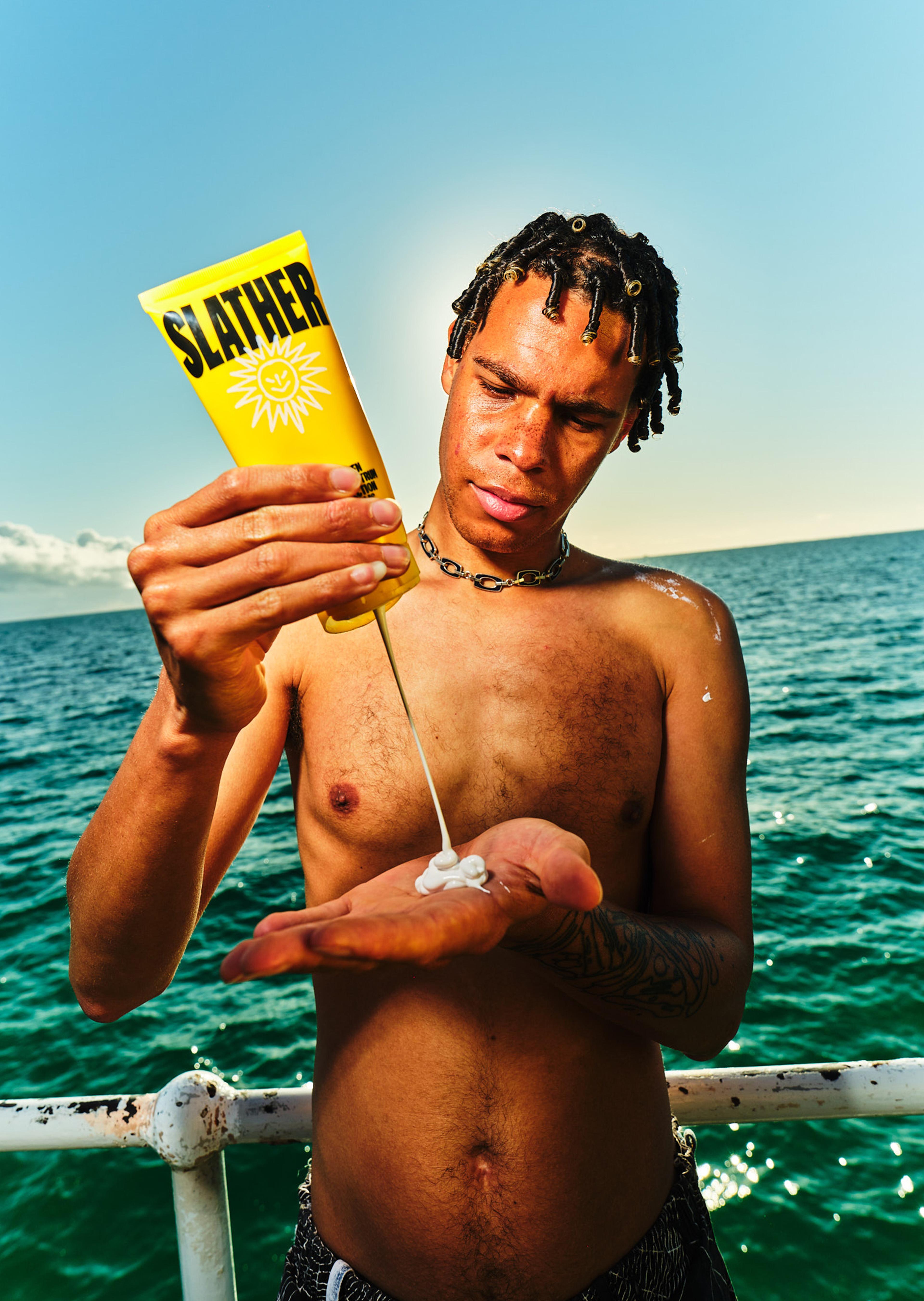
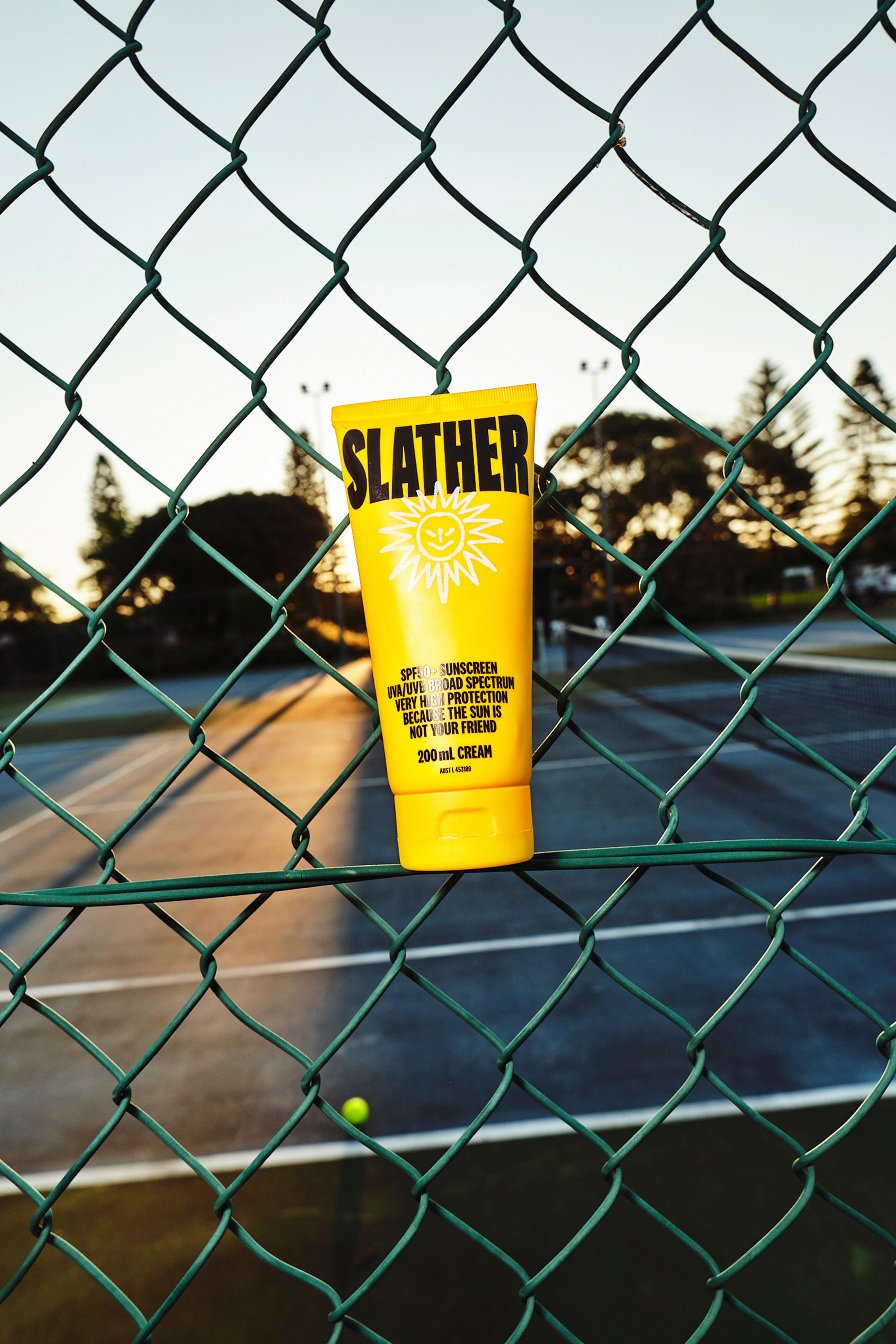
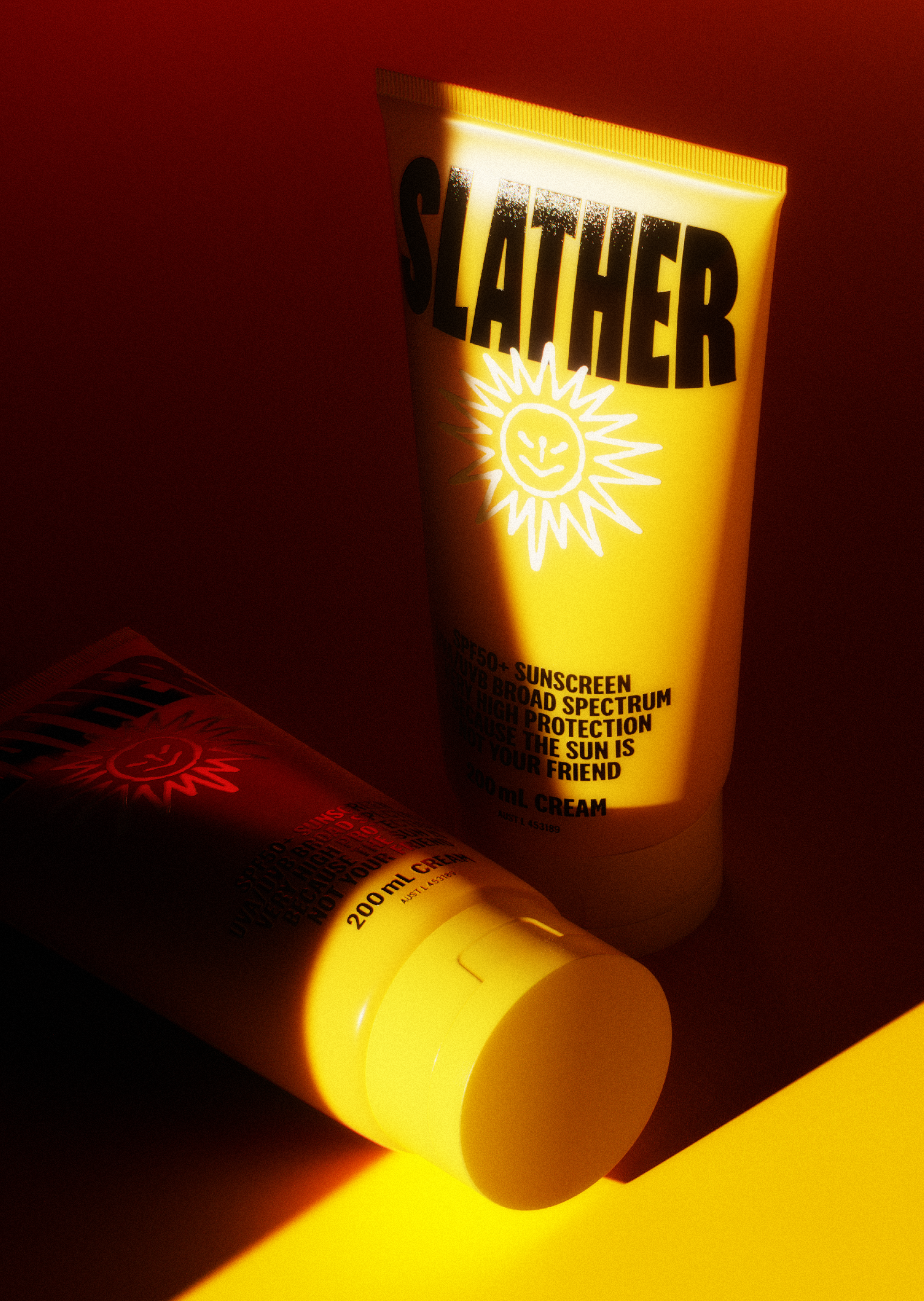
Aussies might love the sun, but it doesn’t love us back. The only thing worse than the sun’s radioactive rays is our attitude to skin protection. We’re officially No.1 in the world for skin cancer, and it’s mostly men who develop and die from it. Which is why we created SLATHER - a High Protection Broad Spectrum SPF 50+ Sunscreen and Moisturiser. And when we say ‘created’, we mean everything. The formulation, the branding, the design, the packaging, the tone of voice, the animation, the films, the website. The whole shabang.


2 in 3 Aussies will get skin cancer in their lifetimes. Men make up most of them - and still only 1 in 5 use sunscreen regularly. Yet, when you look at the skincare and SPF category, no one is talking to them. The category is awash with either cold and clinical or feminine aesthetics and messaging, whilst overtly promoting a sun-loving culture. Likely all contributing to the aforementioned very horrible statistic. So, we decided to do what no other brand dared.


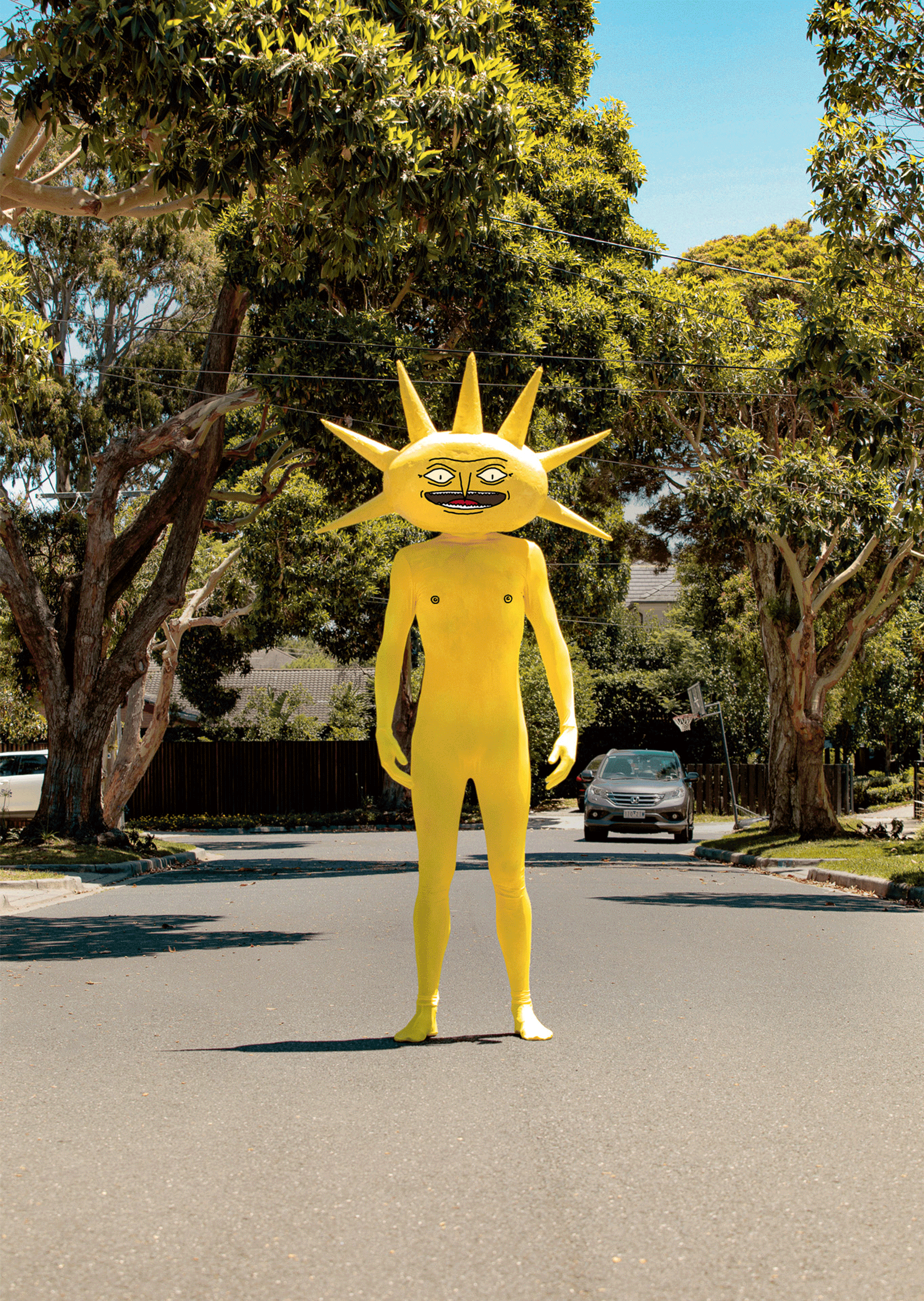
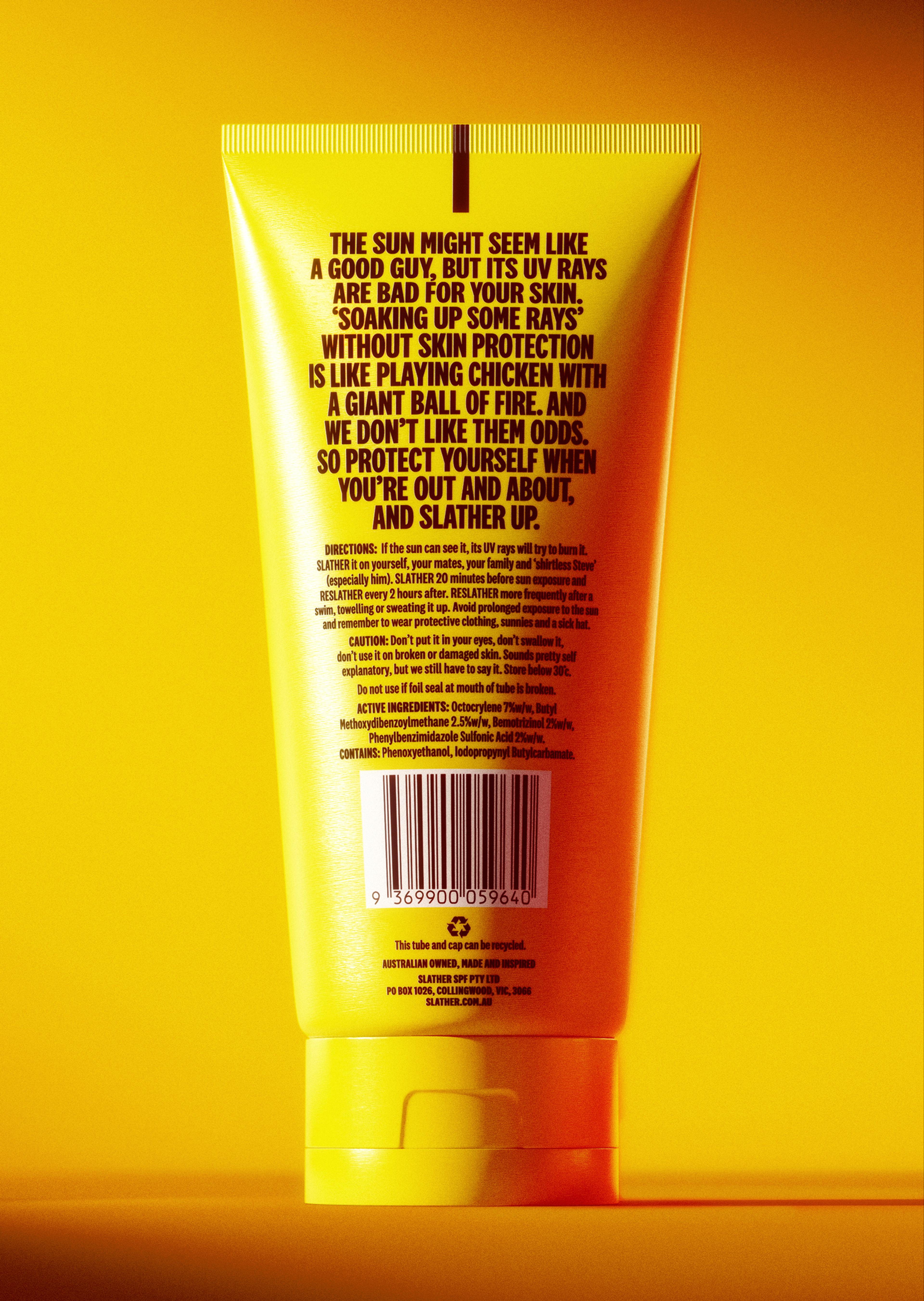
Create a sunscreen brand that speaks the quiet truths. Loudly. That skincare isn’t just for women. That sunscreen isn’t just for the swimming pool and the beach. That being vigilant in regard to the sun’s potentially damaging rays is for everyone - especially men. And wrap it all in a look, feel, and tone that the SPF category had never seen before.
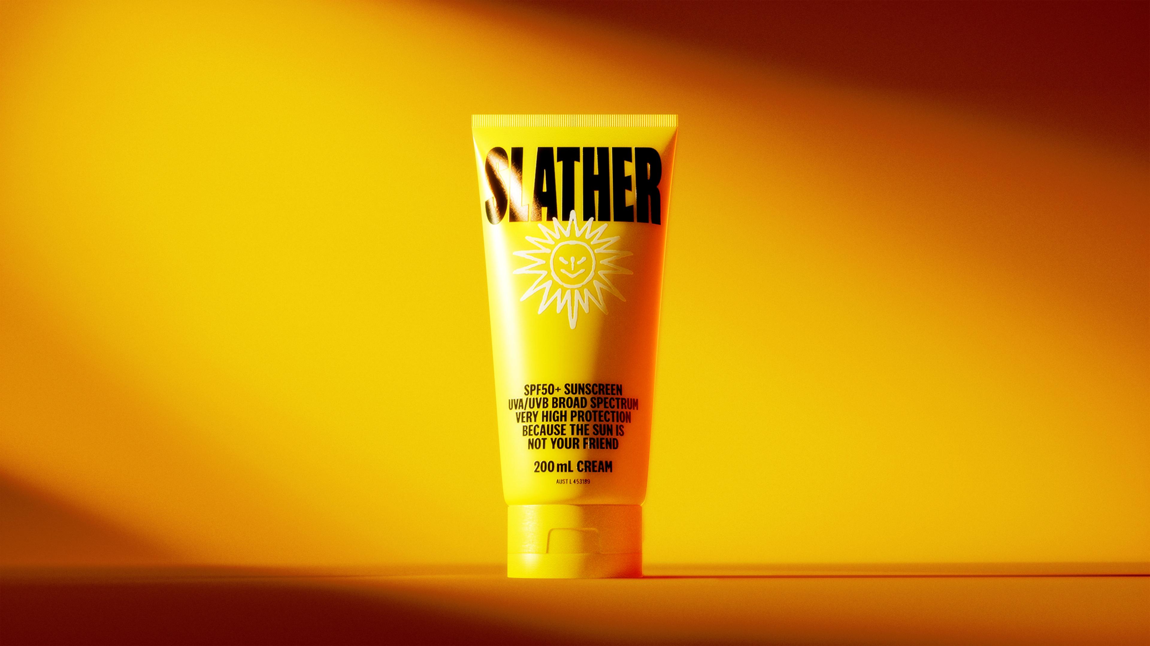

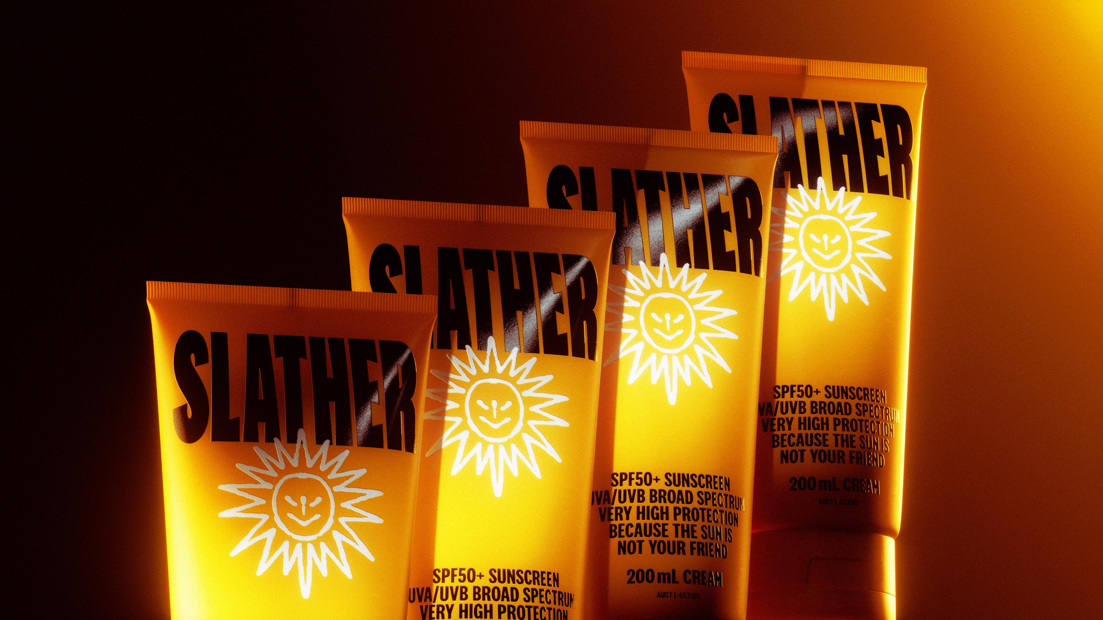

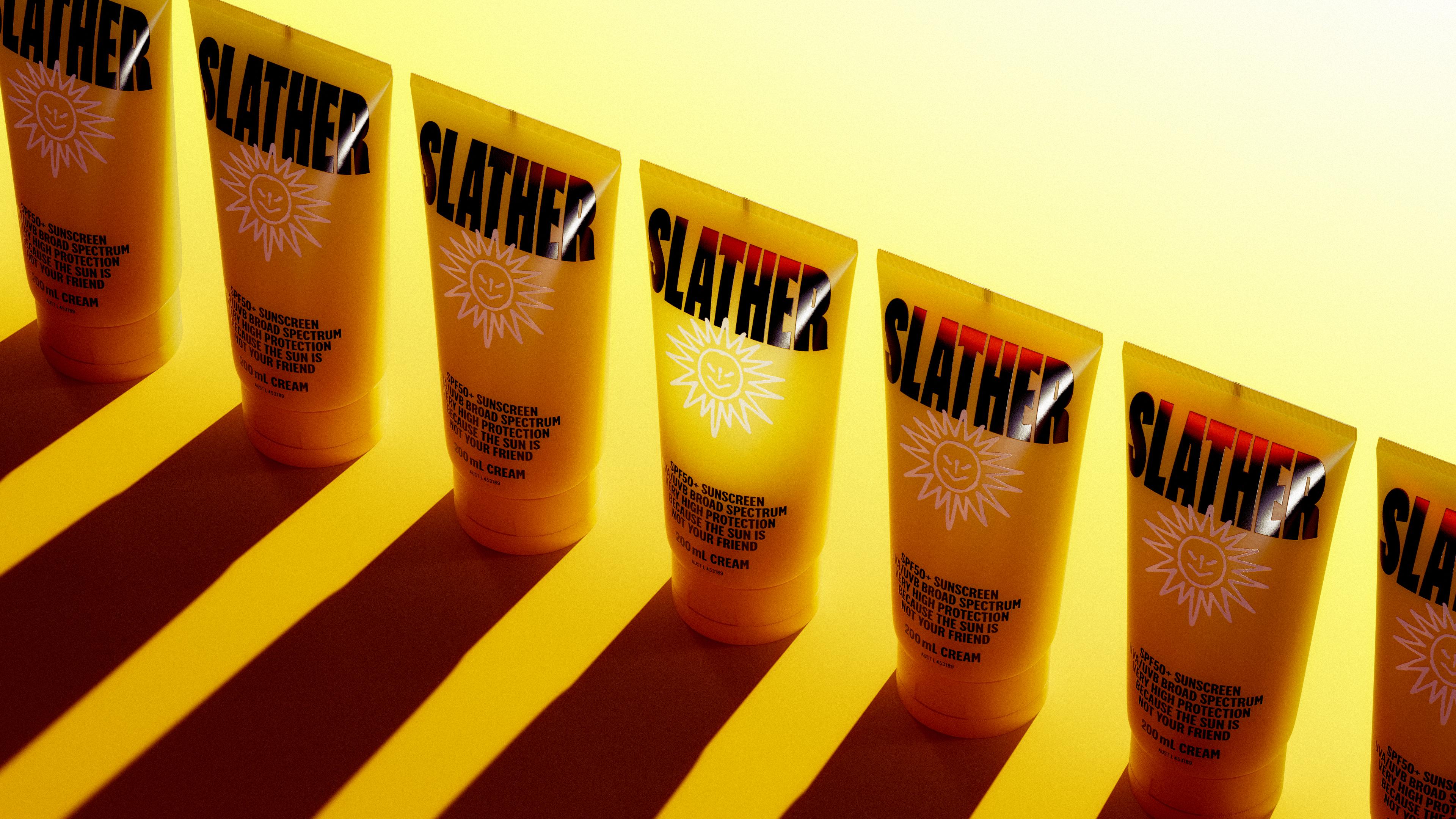

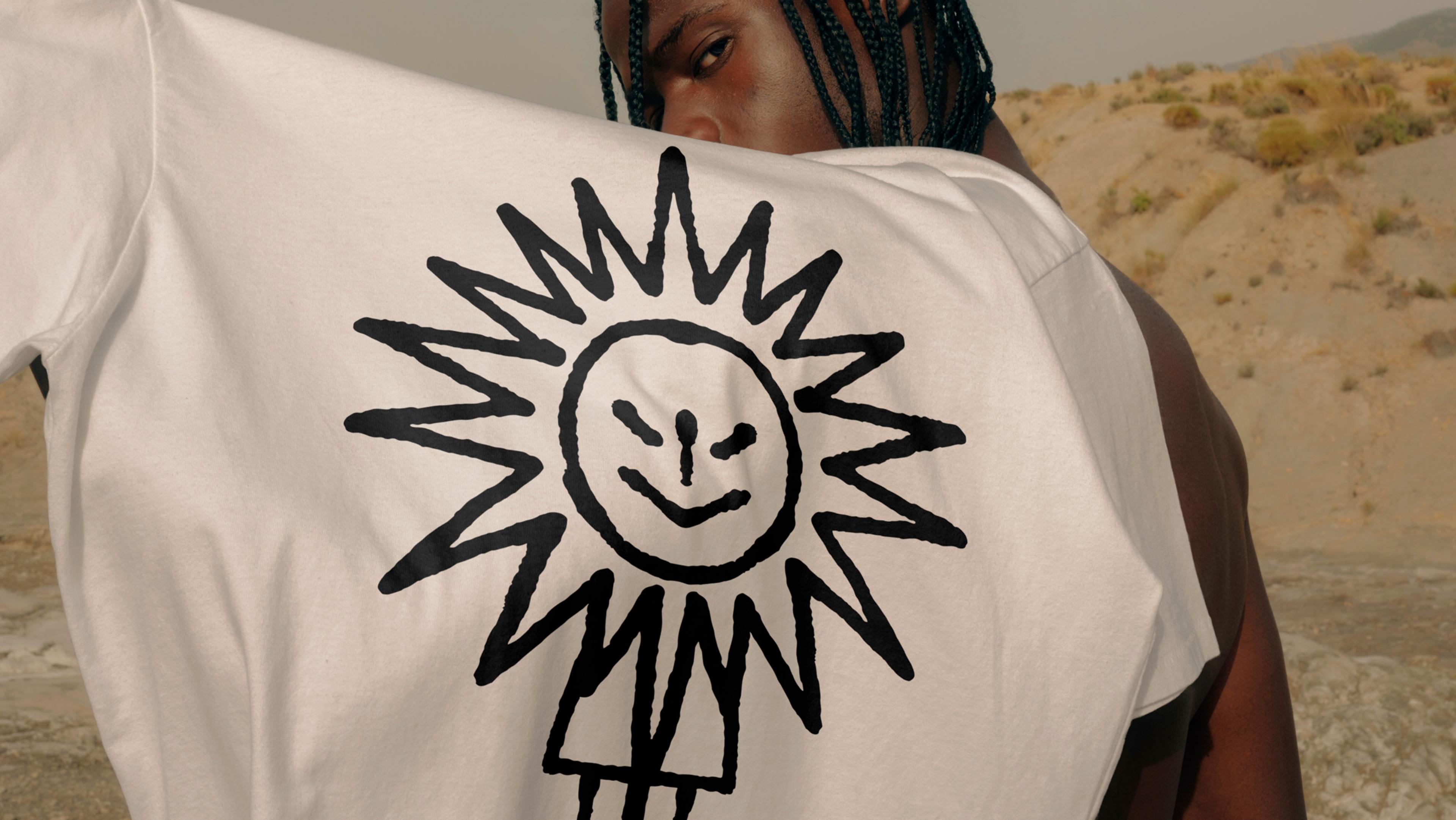
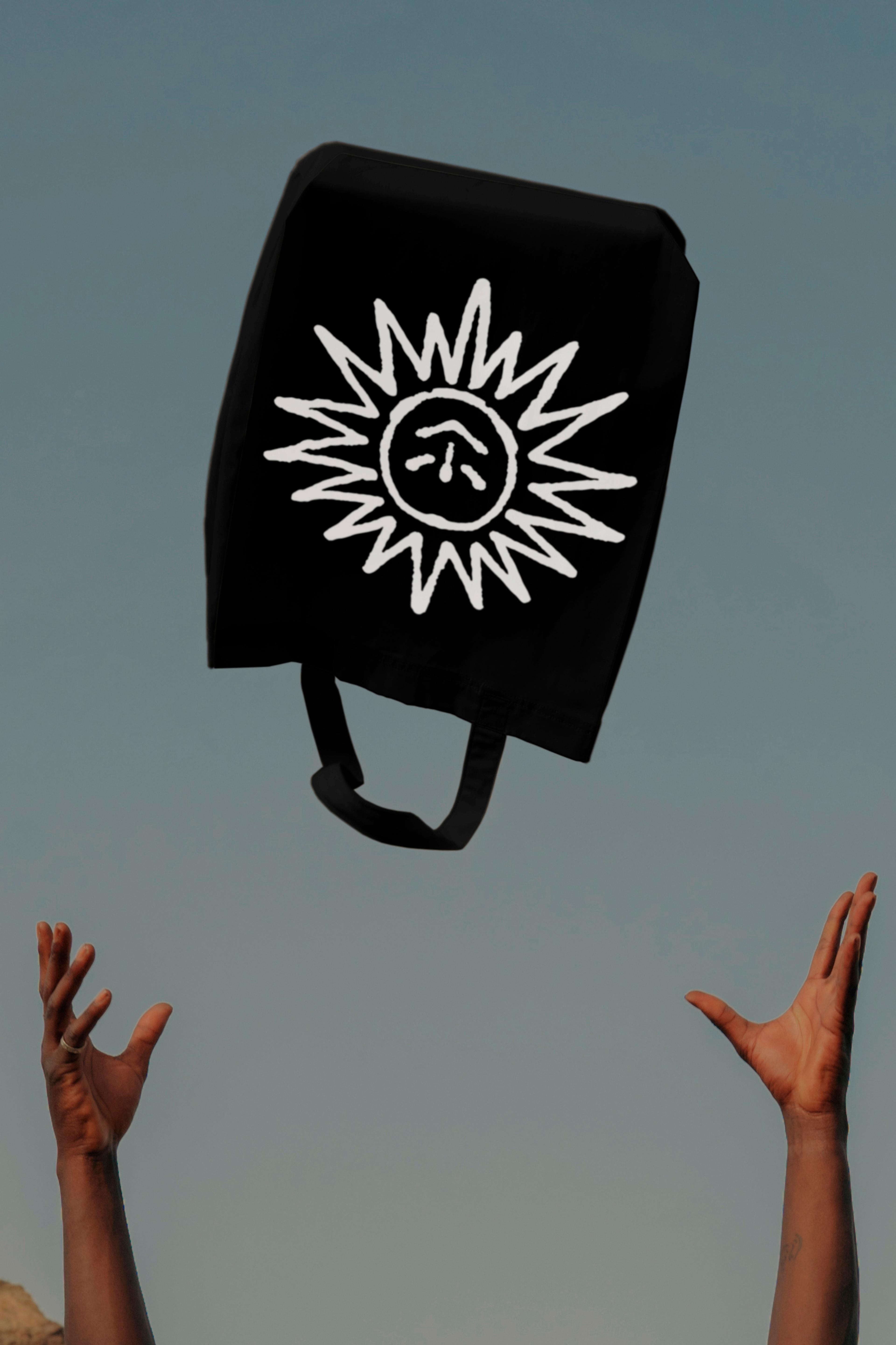
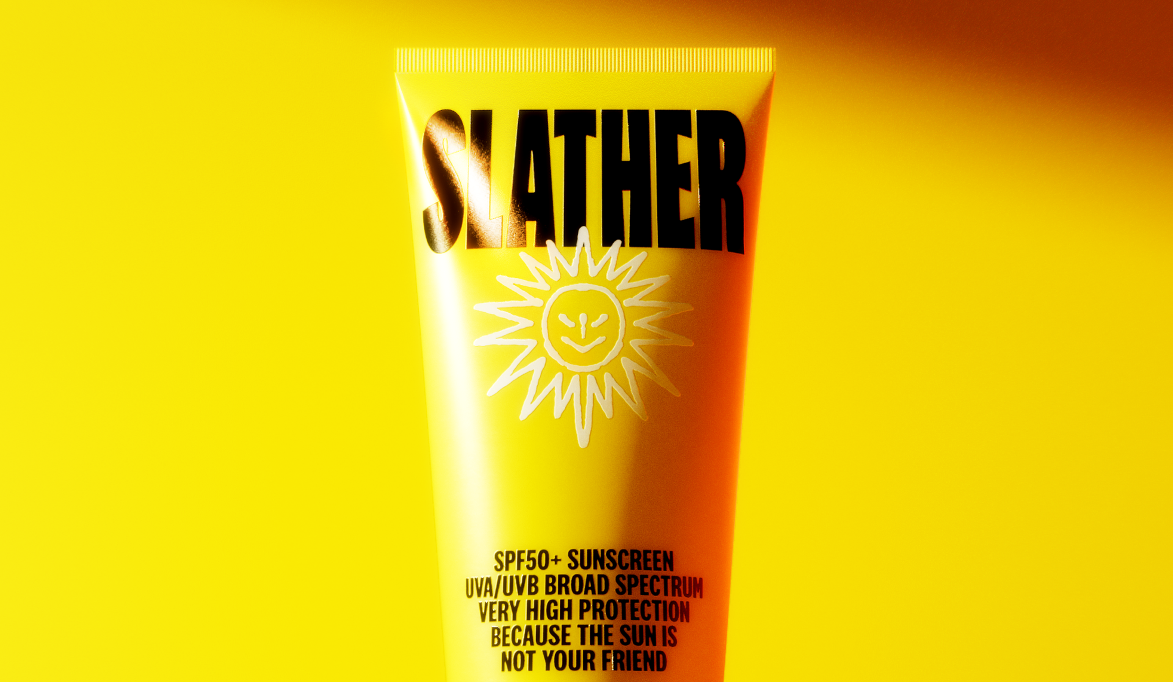
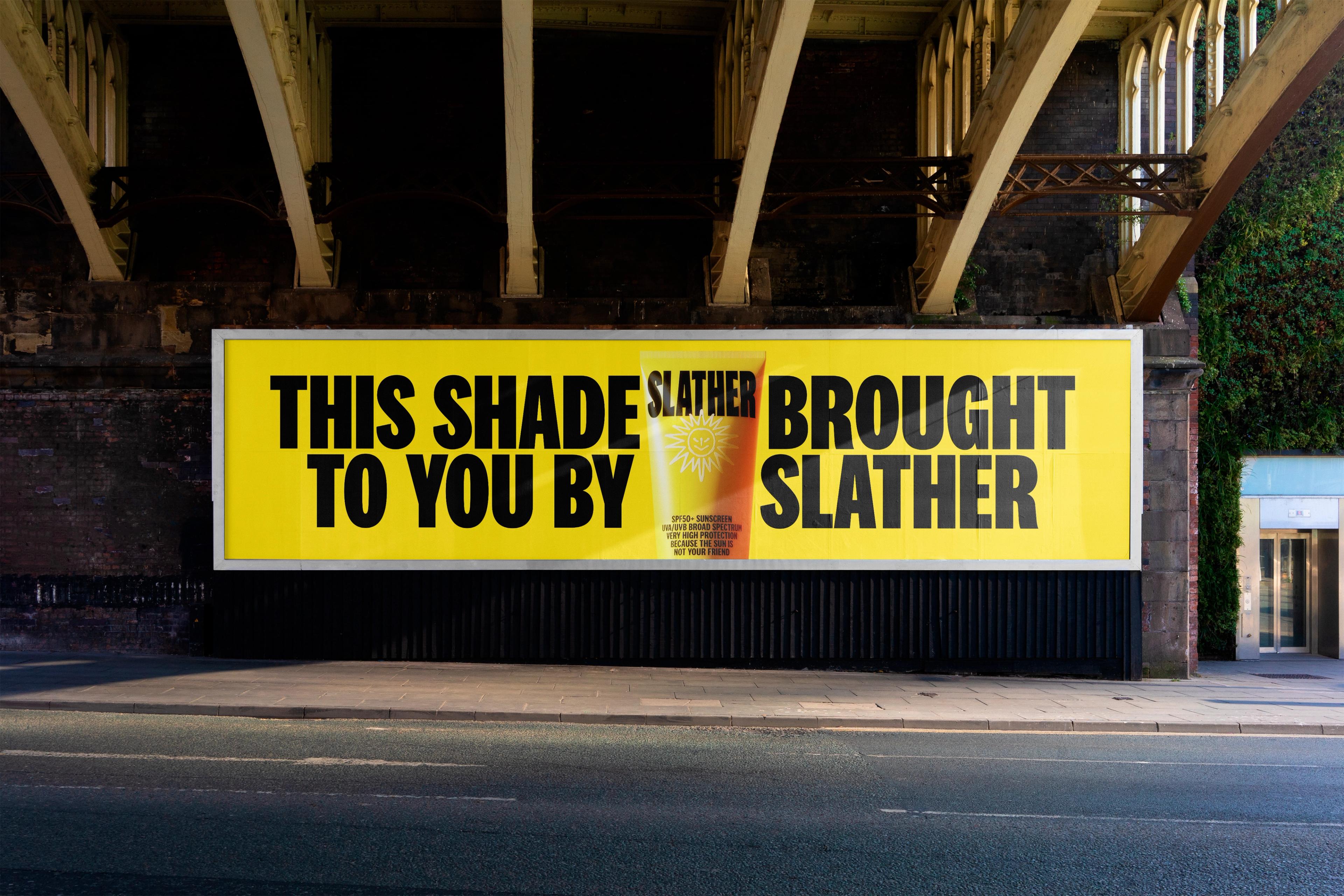
Bold yellow packaging. Heavy hitting wordmark. Razor sharp tone. And if we’re selling skincare and sun protection, then it hardly feels right to paint the guy killing us all as a hero, does it? So we made it a villainous mascot. A swell of insights, statistics, truths, design, tone, aesthetic, and delivery all channeled into one big truth - The sun is not your friend.