
Never NeverFearless Spirit
- Packaging
Never Never came to us with a rare challenge: Take a gin deeply loved by bartenders and enthusiasts and open it up to the world at large. And, importantly, without losing its soul. The type of challenge we drink up. (Sorry, we had to.) Trends were off the table, this needed to be the foundations of an enduring masterbrand. Something that could stand tall in the mass market while still speaking to those seeking adventure in a glass. A beacon on the shelf, beckoning from afar, enticing discovery up close, and with all the quiet confidence of a brand stepping out into the horizon whilst holding tight to the fearless spirit that made it so special in the first place.
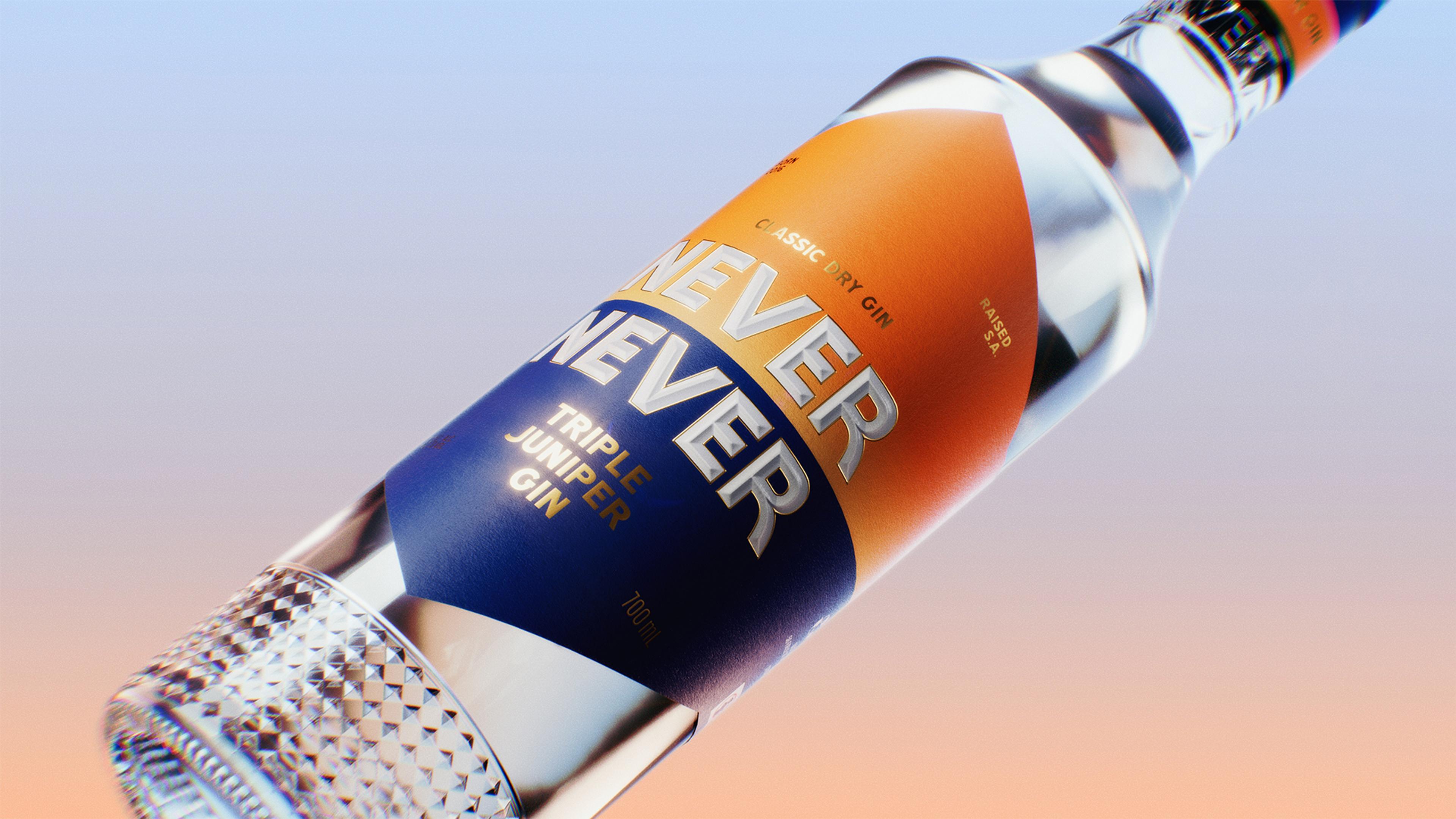

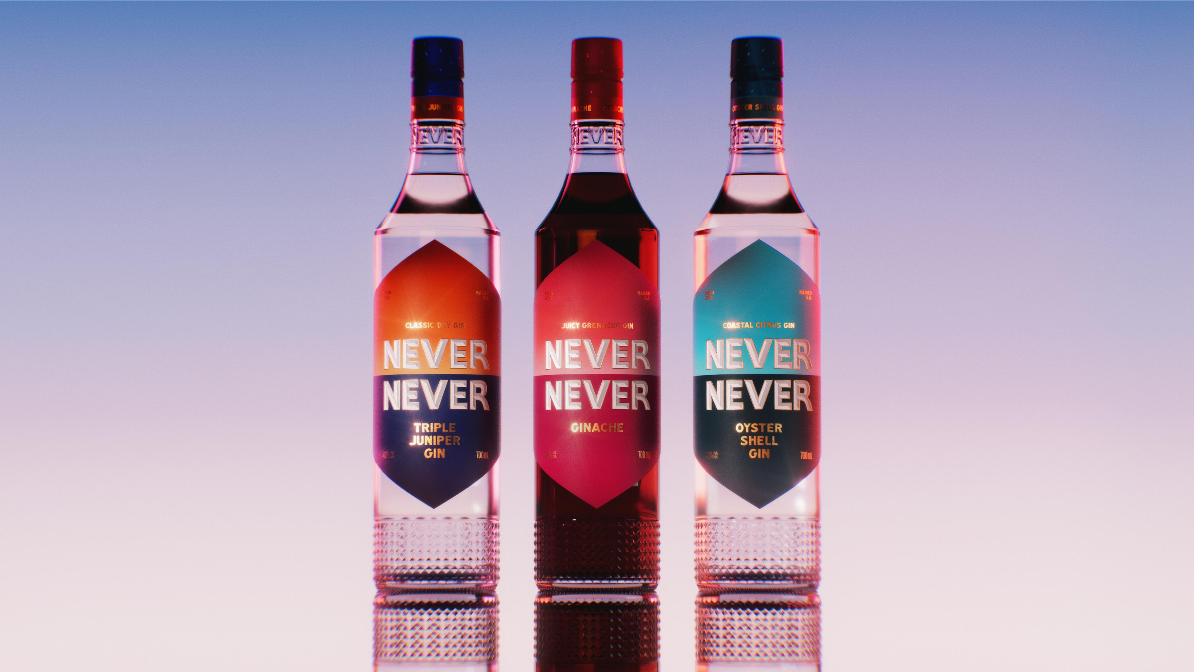

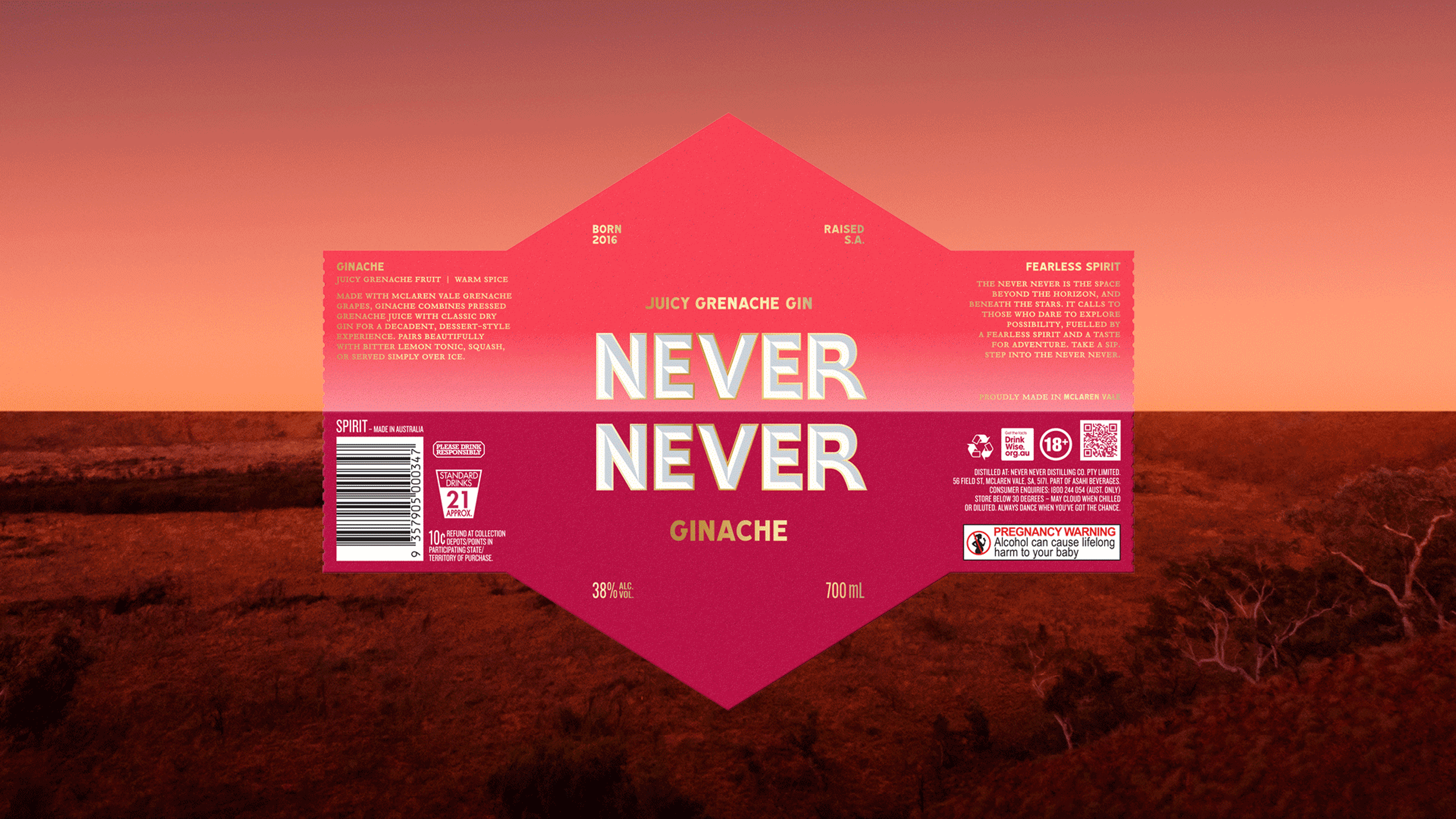
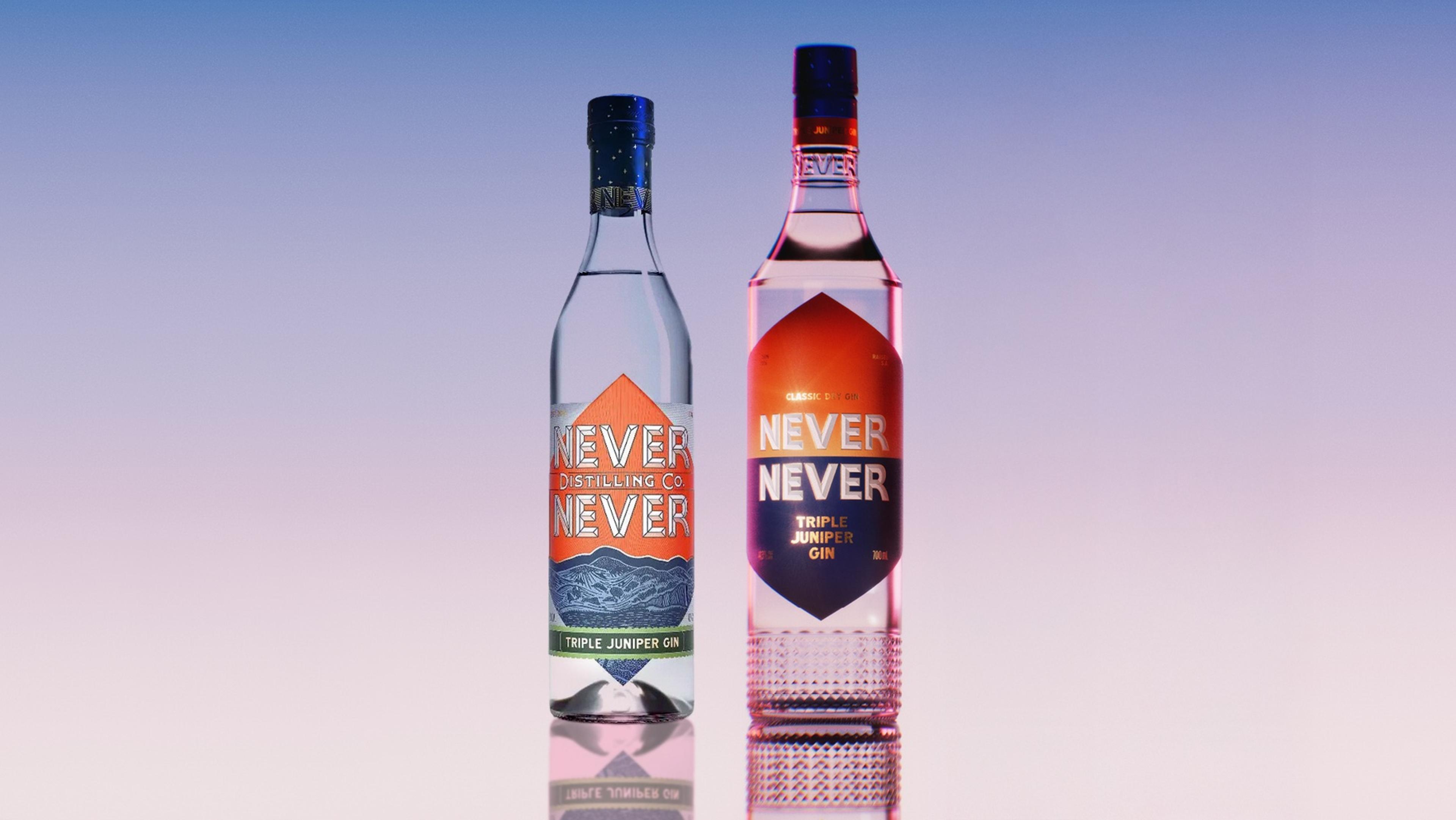
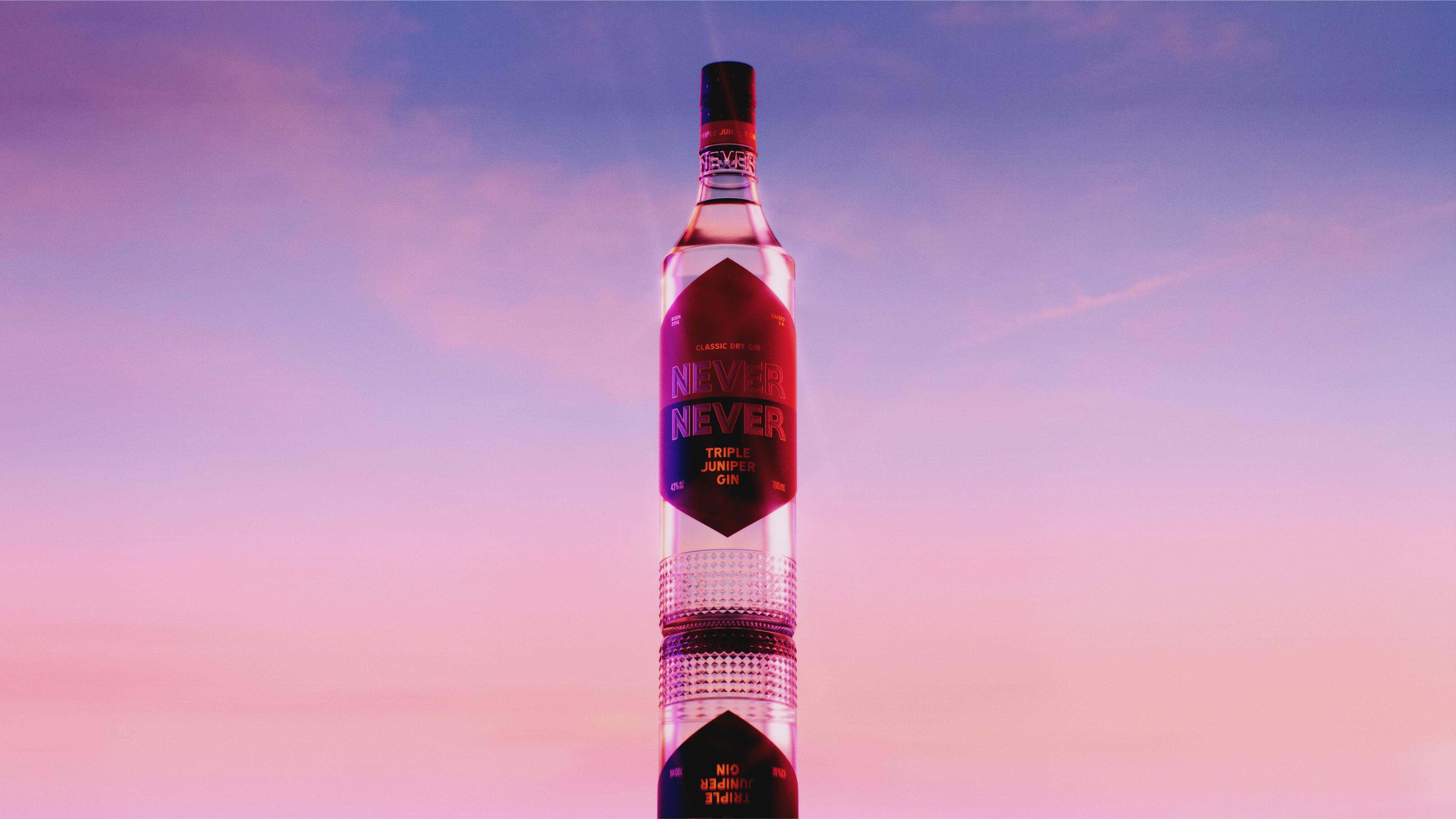
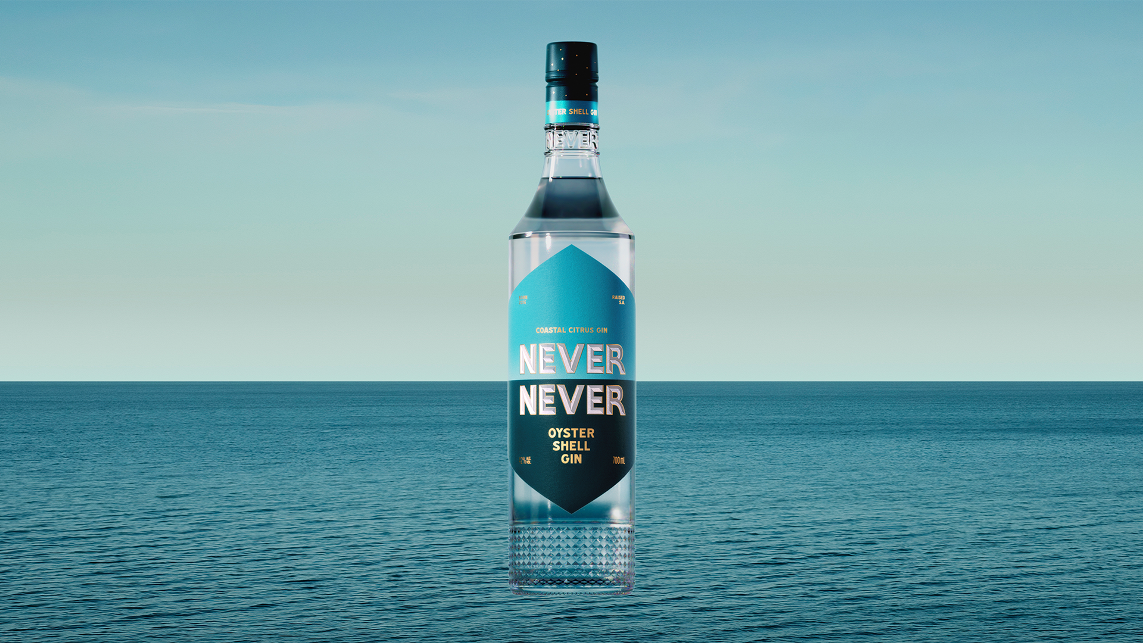
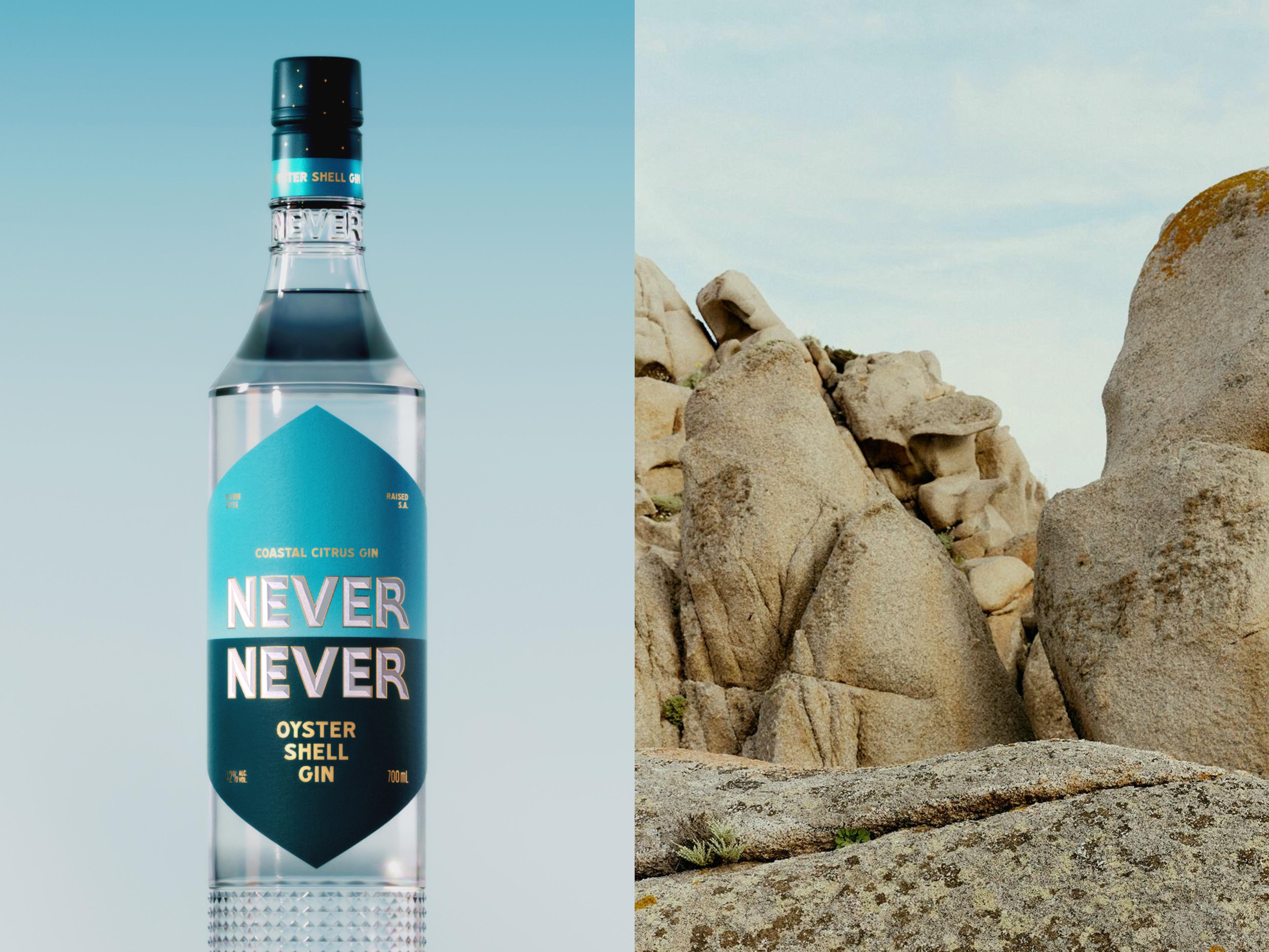
At the heart of the design is a simple idea, an abstracted horizon inviting the drinker in and evoking the story and the promise of the Never Never beyond. We evolved the wordmark to nestle on the horizon and designed a colour system for each product in the range, featuring iconic colour pairings that speak to the flavour, place, and time, all inspired by the rugged, beautiful, windswept landscapes of South Australia.
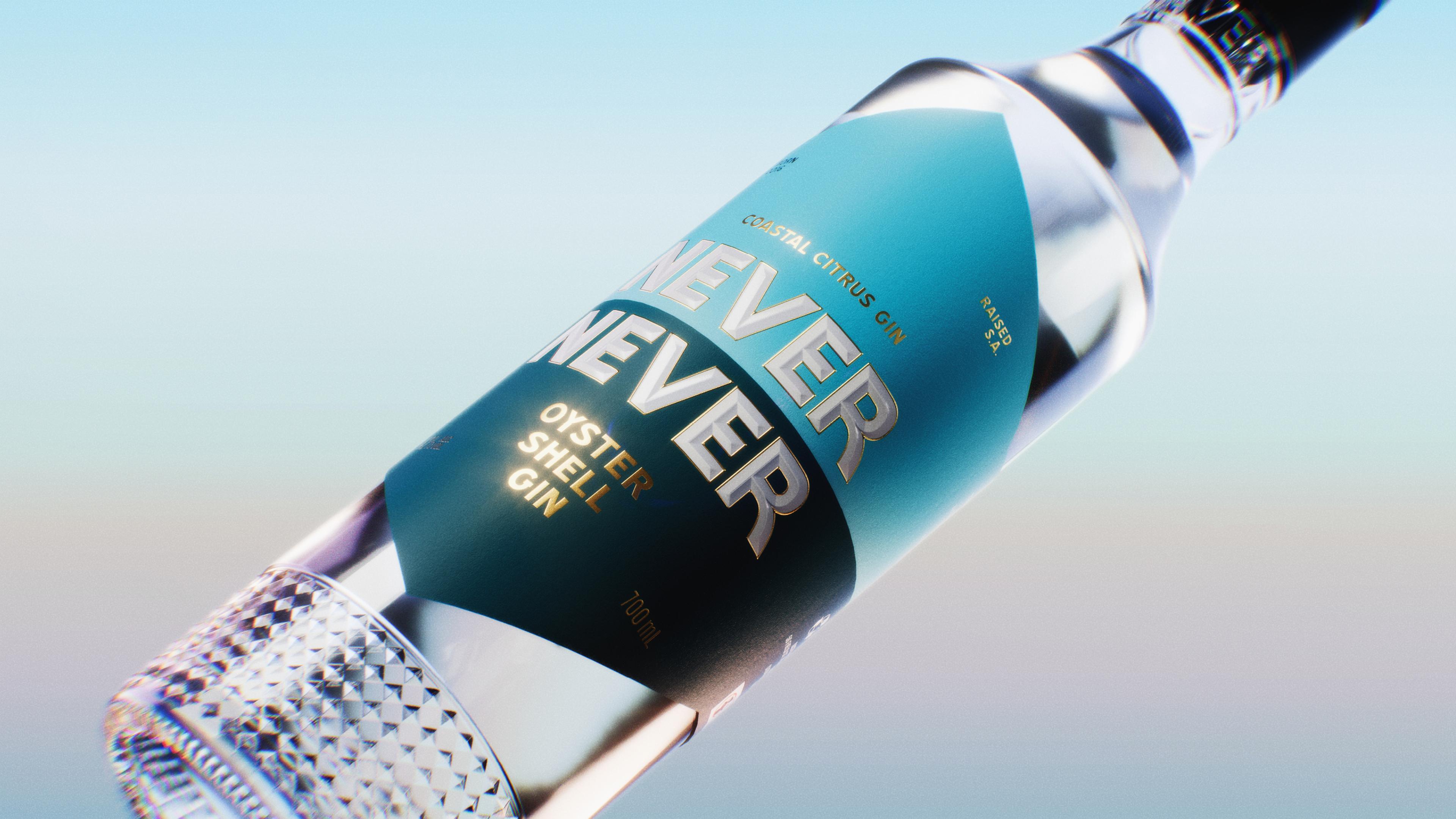


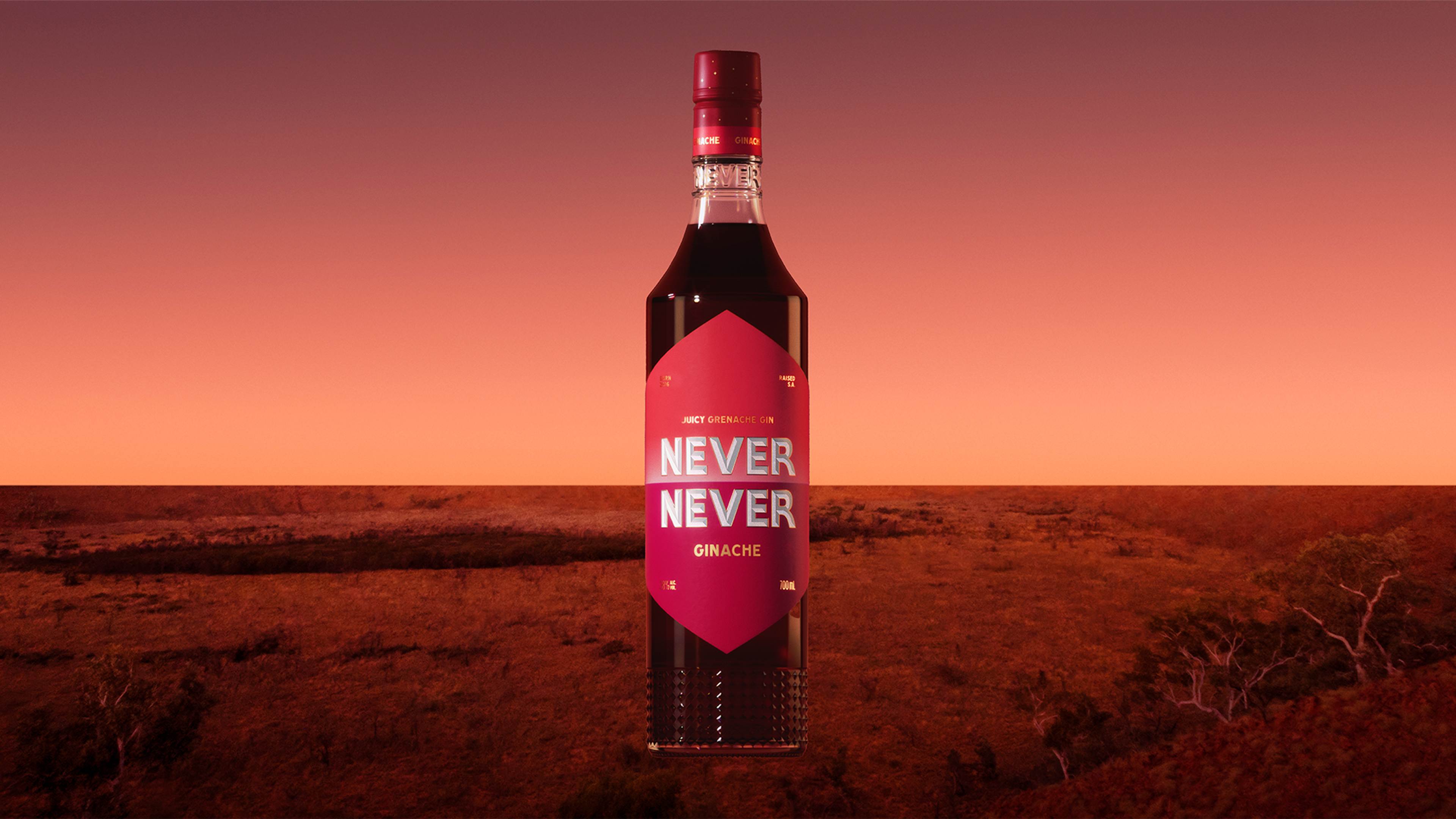

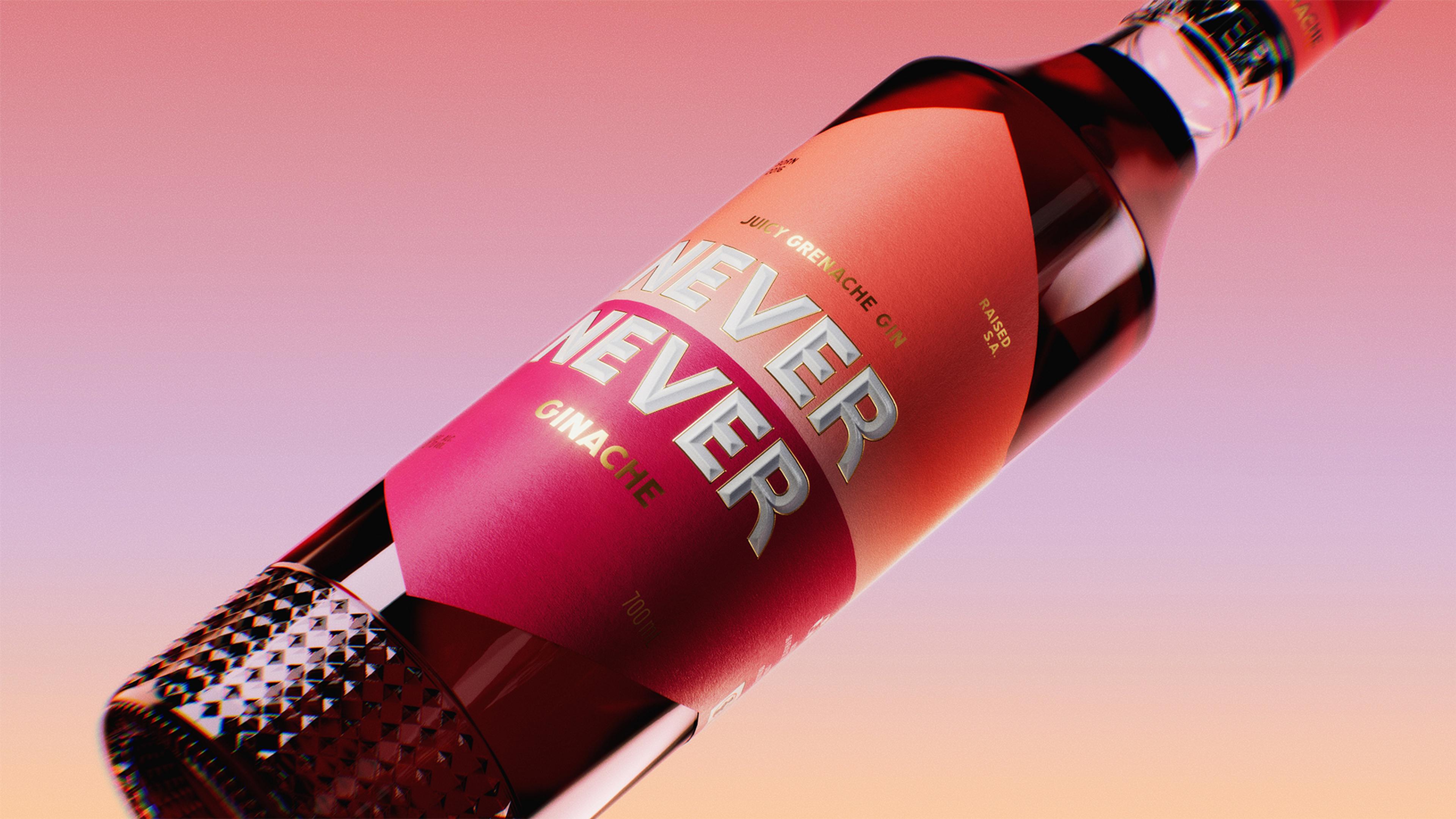

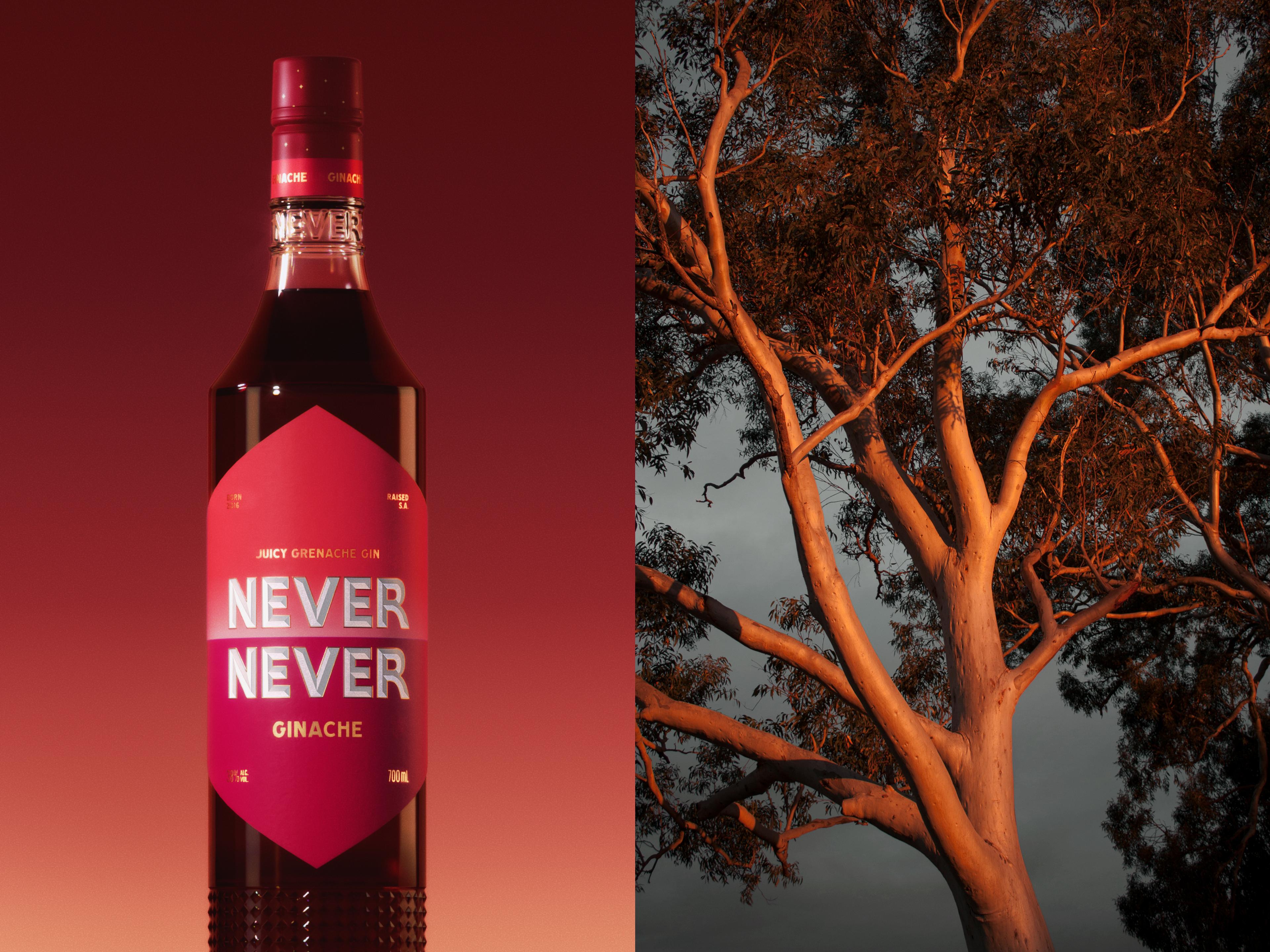

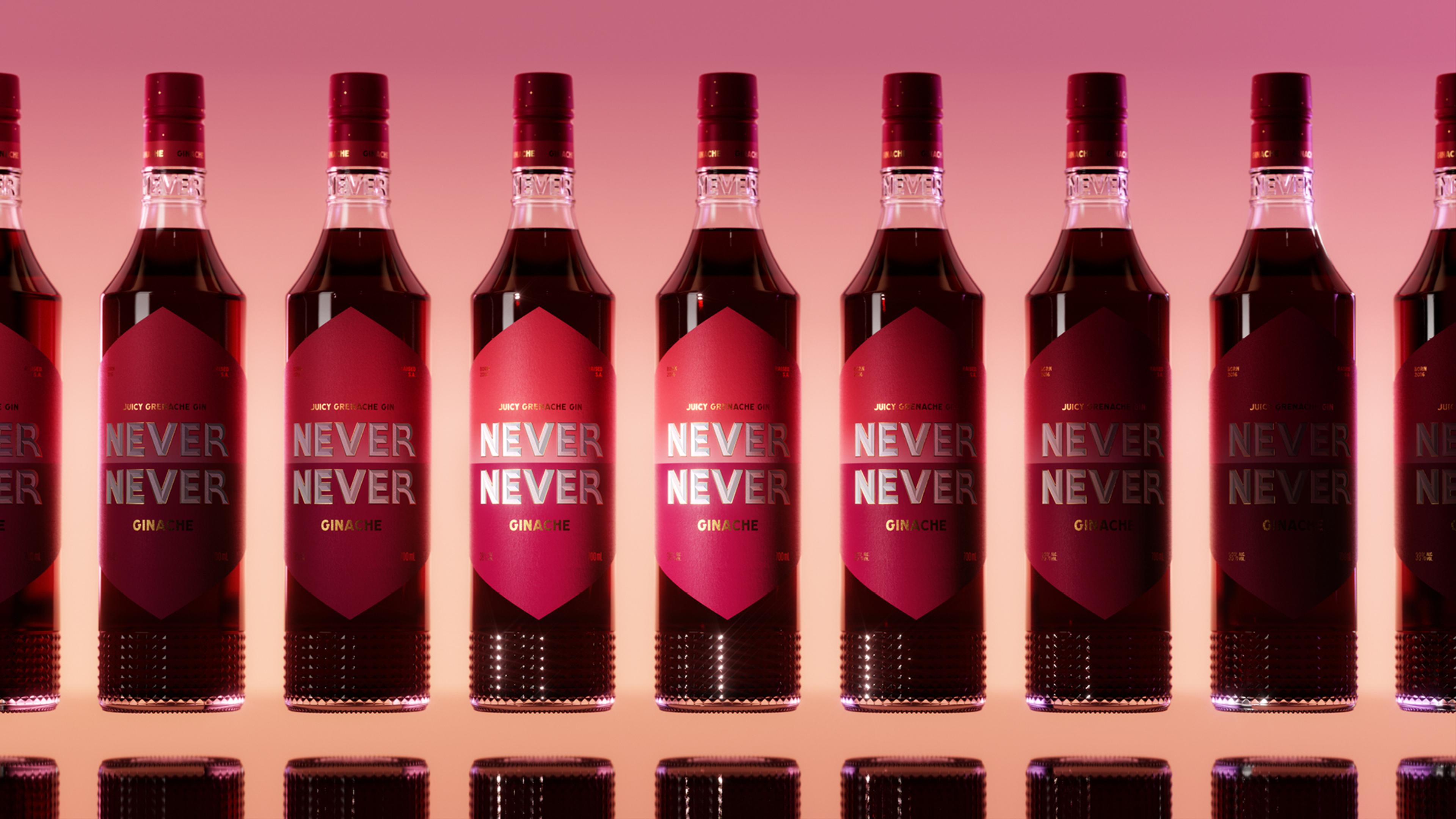

Key to the redesign was an entirely new bottle, stepping up from a 500ml to a 750ml format, creating an iconic profile that’s instantly recognisable on the back bar or in hand. The form is deliberately bartender-friendly, with balanced weight and grip, built for easy pouring. An elegant inverted neck adds a distinctive silhouette, supported by a star detail in the base to subtly elicit the brand story of ‘the Never Never’. Every element has been thoughtfully considered to make the bottle both a functional tool of the trade and a beautiful object worth keeping.